Artist Profile: Alex Maleev


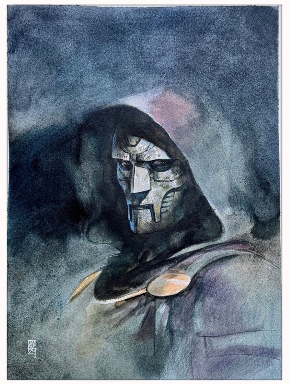
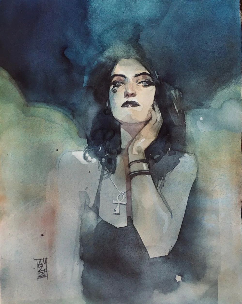
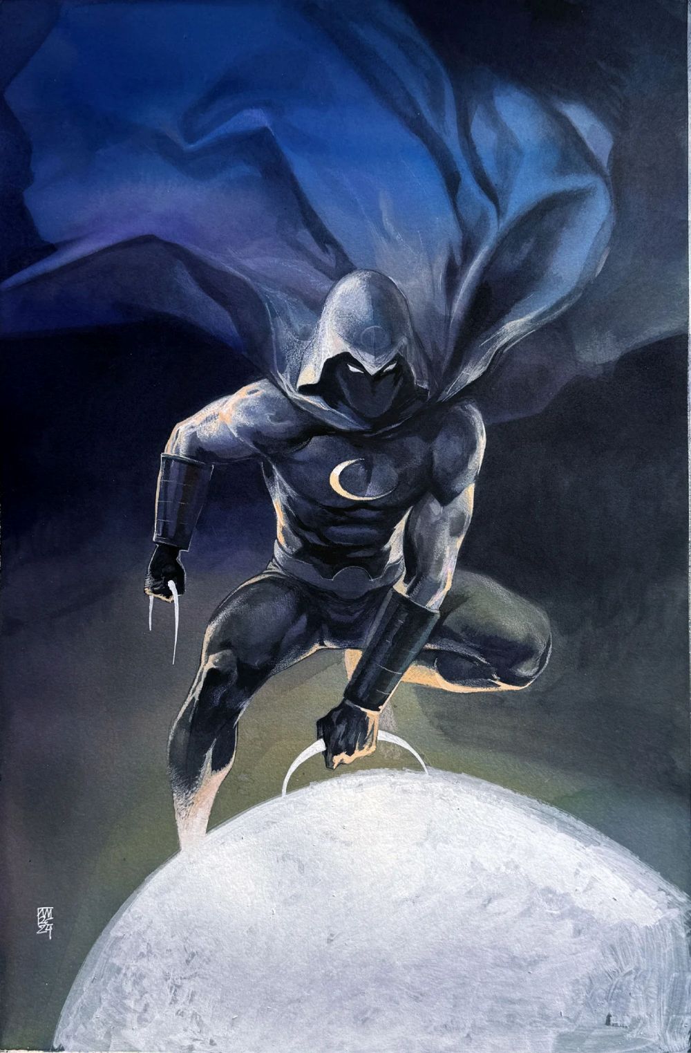
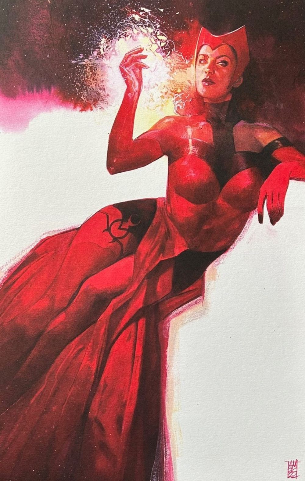
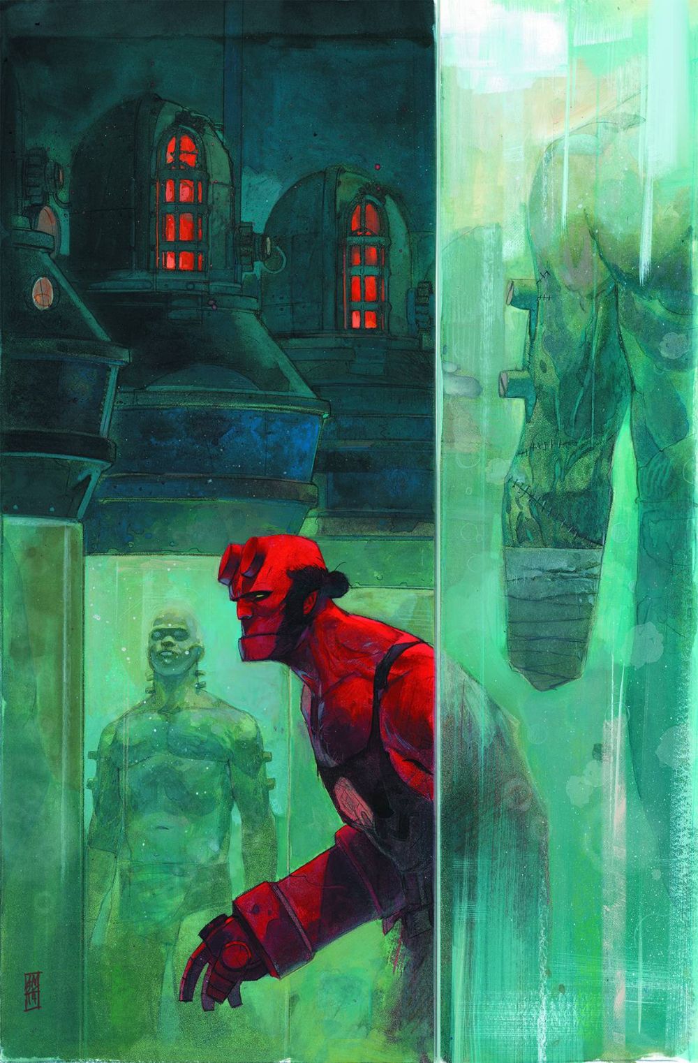
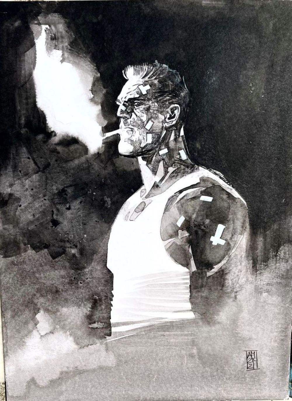
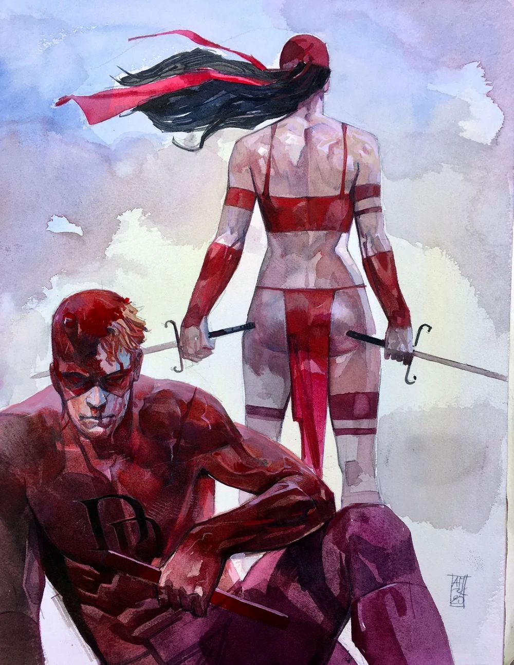
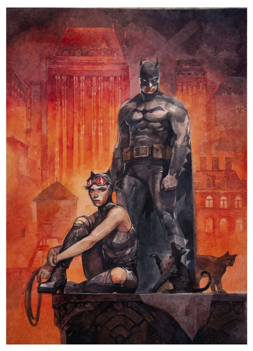
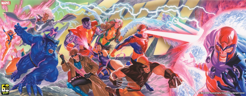
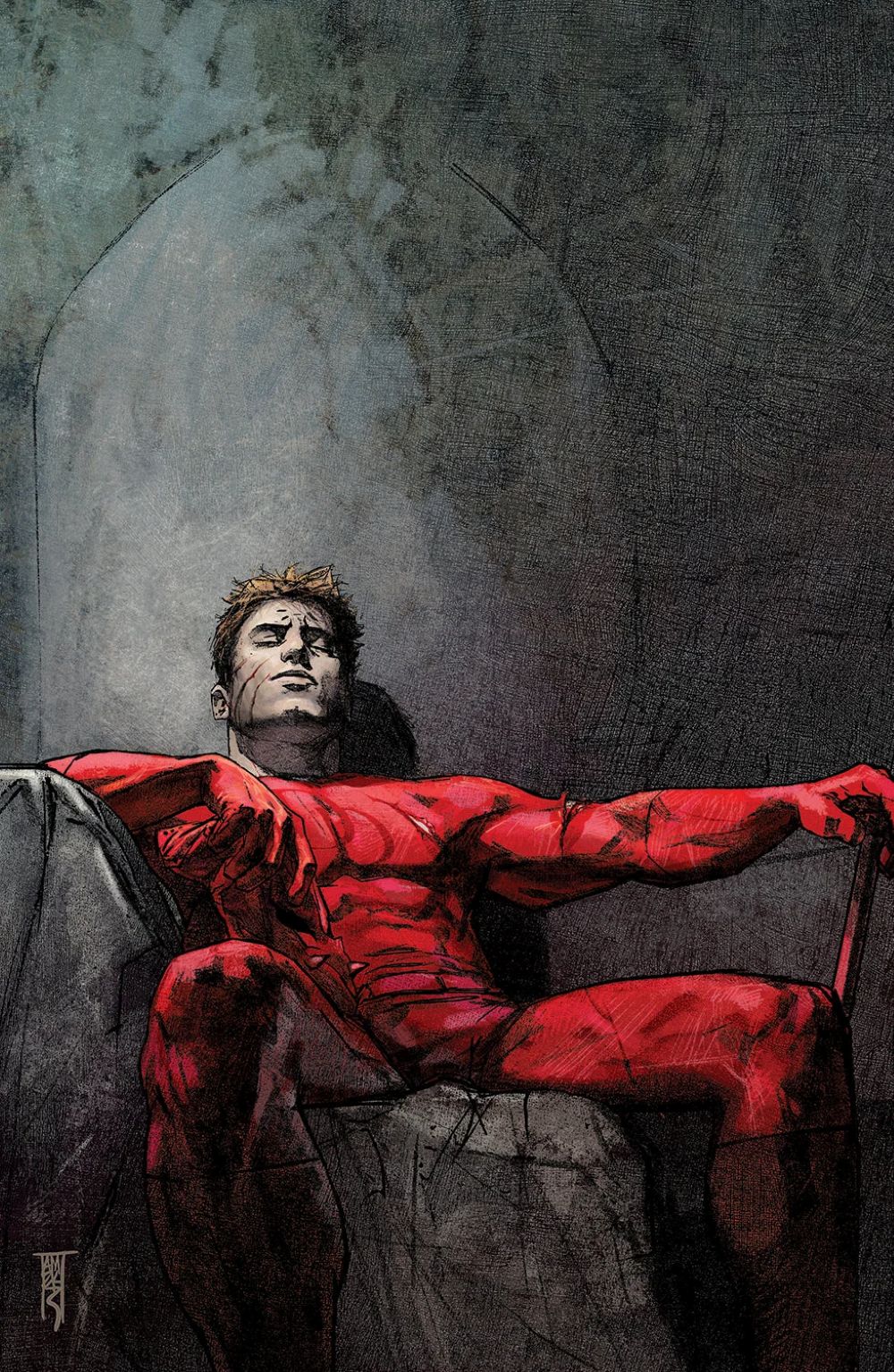
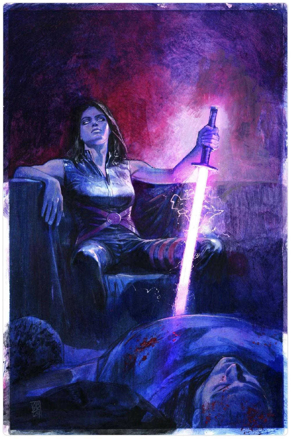
Alex Maleev’s work stands out because it makes superhero comics feel physically inhabited rather than merely illustrated. His figures are not polished icons frozen in clean, declarative poses; they look exhausted, wounded, watchful, and frighteningly close to the people one might pass on a city street. Through textured linework, severe shadows, photographic reference, digital manipulation, and painterly color, Maleev developed a noir-inflected visual language that lends even familiar Marvel characters a sense of emotional weather. The grime on a wall, the hard light on a face, or the oppressive darkness surrounding a figure can carry as much narrative force as dialogue. His approach favors mood, intimacy, and psychological pressure over conventional superhero spectacle, which is why his pages often feel closer to crime cinema or an urban thriller than to traditional four-color adventure comics.

That sensibility found its defining expression in his celebrated collaboration with writer Brian Michael Bendis on Daredevil. Maleev was not simply illustrating Matt Murdock’s stories; he helped redefine the character’s world as a bruised, morally unstable, and deeply personal version of Hell’s Kitchen. The Bendis–Maleev run brought a grounded visual credibility to Daredevil’s civilian life, legal battles, criminal enemies, and private anguish, making every close-up and every dimly lit room feel consequential. Their earlier work on Sam and Twitch, and subsequent collaborations including Spider-Woman, Moon Knight, Scarlet, New Avengers material, and Halo: Uprising, demonstrate how adaptable that partnership could be. Still, Daredevil remains the central achievement: an acclaimed run whose visual atmosphere helped establish the template for a darker, more adult, and more psychologically intimate kind of Marvel storytelling.

Maleev’s legacy is therefore not just that he produced memorable covers, faces, or grim cityscapes, but that he expanded what mainstream superhero art could communicate. At a time when the genre could easily default to glossy anatomy and kinetic bombast, he proved that visual discomfort, ugly realism, silence, and shadow could be as powerful as a splash page. His art also helped legitimize a more hybrid, mixed-media mode of comics illustration—one that uses painting, photography, design, and sequential storytelling without treating any of those tools as mutually exclusive. Emerging from Bulgaria’s comics scene before becoming a major American-comics figure, Maleev built a body of work that remains immediately recognizable: moody, tactile, cinematic, and relentlessly human.

Artist Profile: Alex Ross


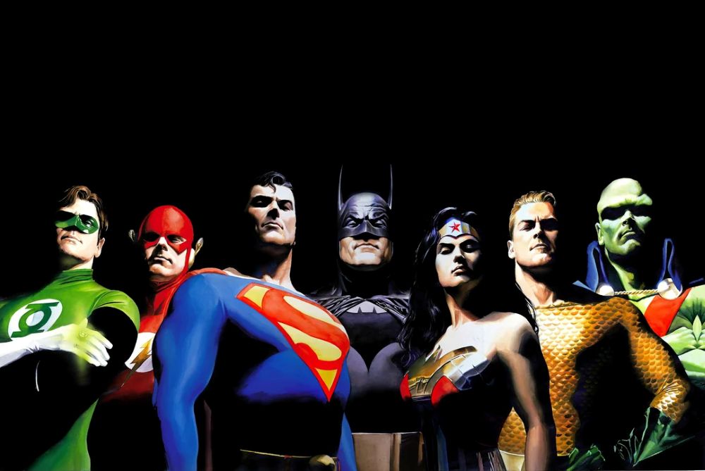
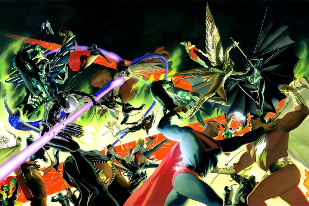
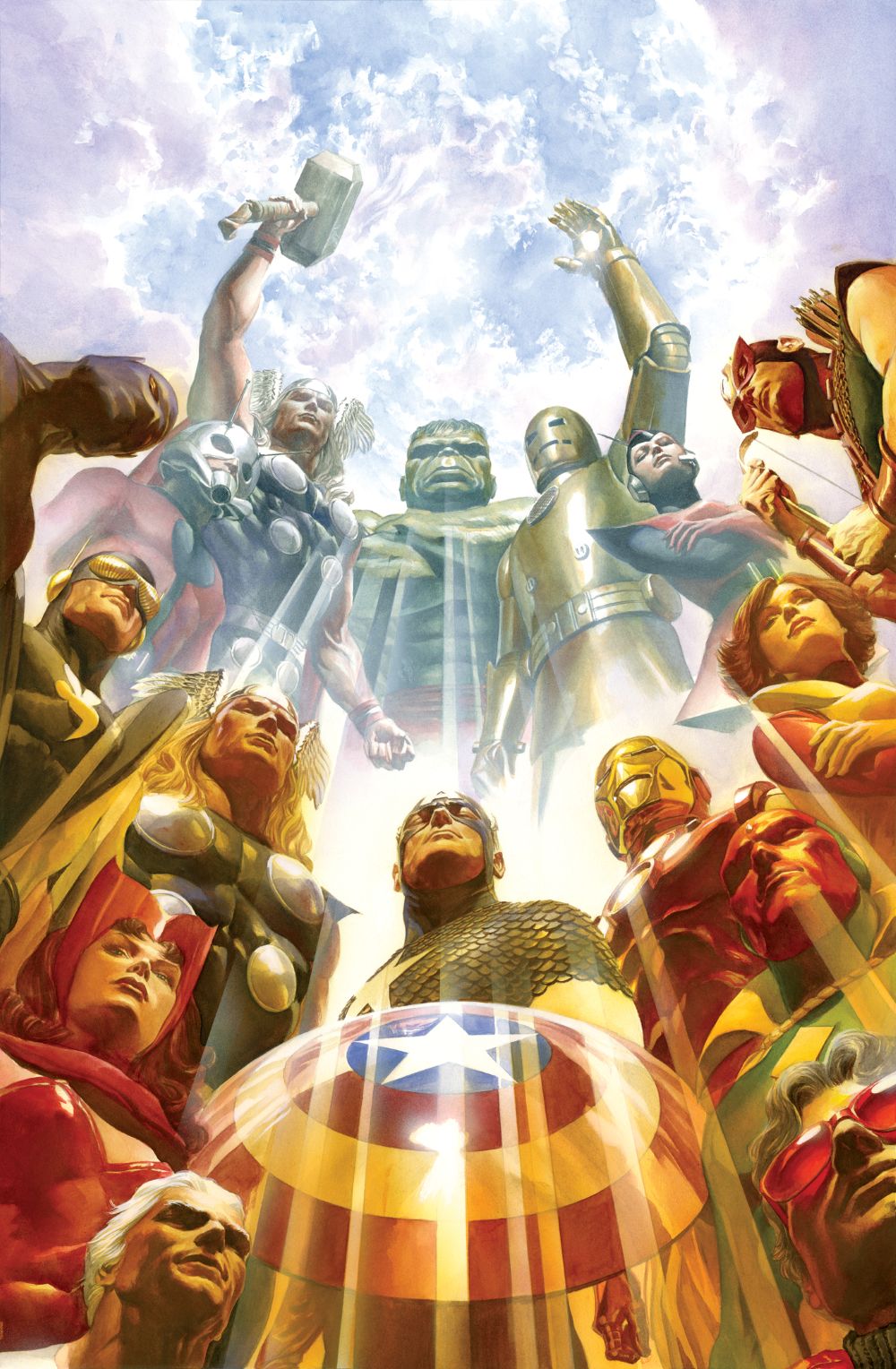
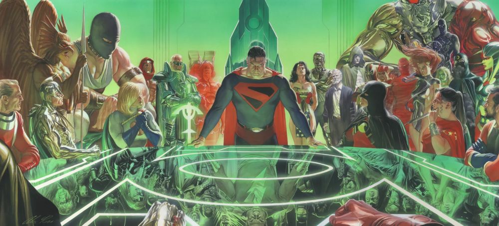
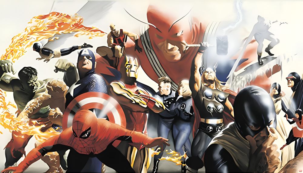
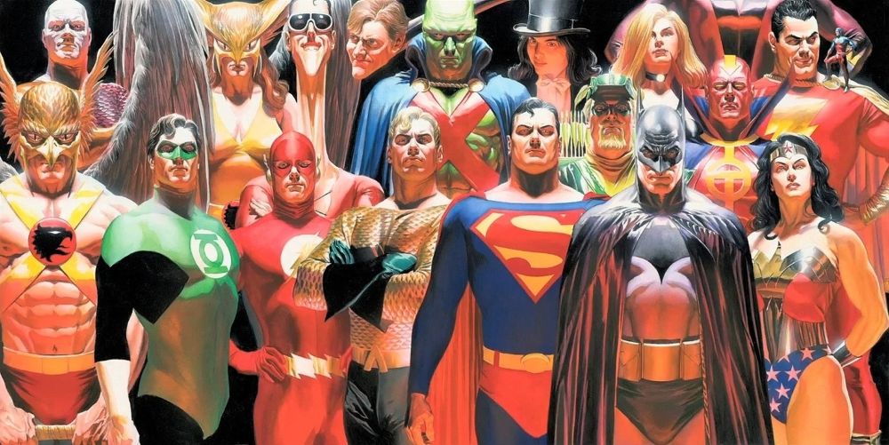
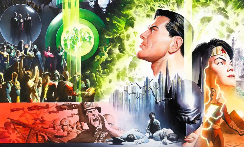
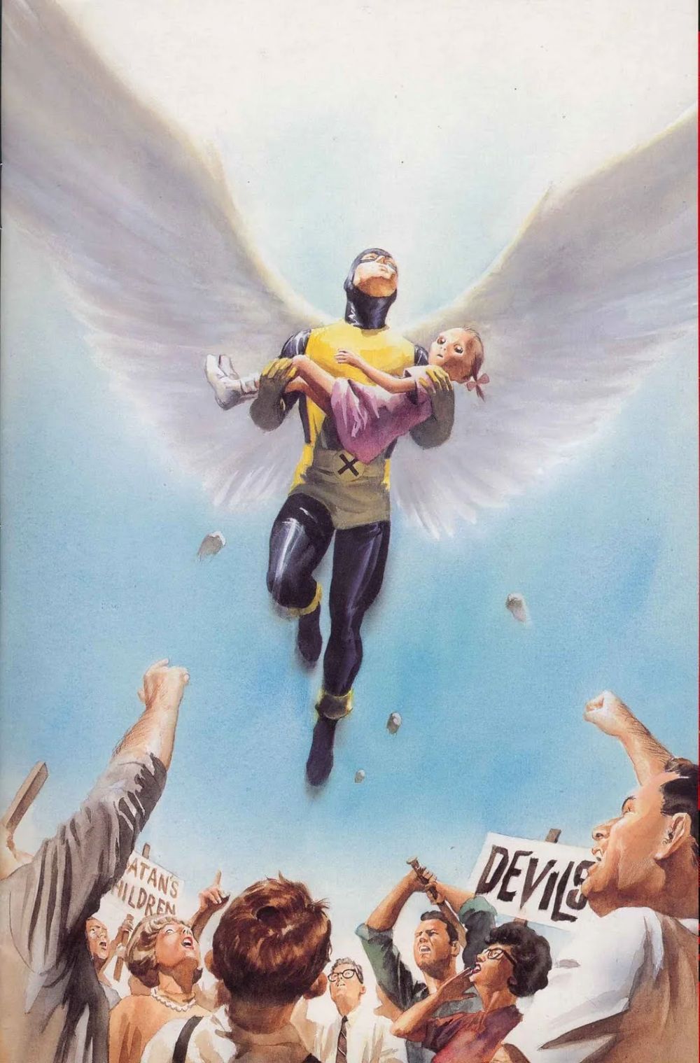
Alex Ross fundamentally transformed the visual language of American comic books by introducing a level of photorealistic fine art painting previously unseen in the medium. Eschewing traditional pen-and-ink line work, Ross utilized gouache, watercolor, and ink to render iconic superheroes with a tangible weight and texture that made them feel startlingly real. His approach treated comic book characters not as colorful abstractions, but as living, breathing figures existing in a recognizable world. By grounding these fantastical beings in reality through meticulous brushwork, realistic lighting, and lifelike facial expressions, Ross elevated the comic book cover and interior page to the status of gallery-worthy illustration, forever changing the expectations of comic book artistry.

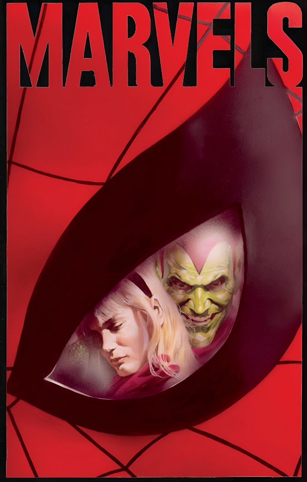
Ross’s impact is indelibly tied to his defining projects for the industry’s “Big Two” publishers. At Marvel Comics, his groundbreaking 1994 miniseries Marvels recontextualized the Golden and Silver Ages of the publisher’s universe through the weary eyes of an ordinary photojournalist, capturing the awe and terror of living alongside gods. He later expanded this sprawling mythos with the Earth X trilogy. However, it was at DC Comics where Ross arguably cemented his legacy. His 1996 magnum opus Kingdom Come offered a grand, prophetic, and deeply moral vision of the DC Universe’s future, utilizing his painted style to bridge the gap between the publisher’s Golden Age innocence and modern cynicism. Through works like Justice and Peace on Earth, Ross continually reimagined DC’s most famous characters, stripping away decades of dark reinterpretations to restore their fundamental nobility and mythic grandeur.

The legacy of Alex Ross extends far beyond the individual pages of his graphic novels; he essentially spawned an entire subgenre of painted comic book art that dominated the industry in the late twentieth century. While many imitators emerged attempting to replicate his style, few could match his nuanced understanding of color theory, historical costume design, and emotional resonance. Furthermore, his aesthetic influence has bled heavily into broader pop culture, with his conceptual character designs serving as direct visual inspiration for numerous animated television shows and live-action films. By proving that superhero mythology could be approached with the same gravitas and classical technique as Norman Rockwell’s illustrations or Renaissance portraiture, Ross forced the comic book industry to permanently expand its artistic boundaries.

Celebrate Easter With Andy Warhol and Edie Sedgwick!


To those who observe the holiday, happy Easter!

Above, we have a picture of Edie Sedgwick and Andy Warhol posing with two rabbits.  I’m not really sure whether or not this picture was actually taken for Easter but let’s pretend like it was.  Andy certainly doesn’t look very happy with his rabbit.

Fortunately, he appears to be in a better mood in the picture below, which also features both Edie and Catherine Deneuve.

And, finally, in this next picture, Andy is finally actually smiling.  How couldn’t you smile with that many rabbits around?  Seriously, rabbits are incredibly cute.

Finally, let’s end this with Andy Warhol’s 1982 painting, Eggs:

Artwork of the Day: New York Movie


new-york-movie

New York Movie (1939, Edward Hopper)

I could never work in a movie theater.

Don’t get me wrong.  I love movies, as anyone who has spent any time reading this site should know.  I consider both the Alamo Drafthouse and the Dallas Angelika to be a second home.  But, even if I didn’t have a degree and I was totally alone in the world and I desperately needed a job, I could never work at either one of them.  I would be scared that, if I did, the act of going to the movies would lose its magic.  My love of film would be destroyed by the drudgery of employment.  (For that same reason, I could also never work in a book store.)

That’s something that I find myself thinking about as I look at Edward Hopper’s New York Movie.  As a writer, it’s impossible for me to look at any painting or photograph without immediately trying to turn it into a short story.  While the theater’s the audience is sucked into the fantasy of cinema, the usher stands to the side and appears to be lost in thought.  Much as I’ve looked at John French Sloan’s Movies, Five Cents and subsequently spent hours considering who the woman in the audience is looking at, New York Movie has inspired me to spend hours wondering what the usher is thinking about while the audience watches the movie.  Is she bored or is she sad?  Is she thinking about the movie or the audience or about what she’s going to do when she gets off work?  Does she like the movie, does she hate the movie, or has she reached the point where she doesn’t even notice the movie?

Edward Hopper’s best known work was Nighthawks, that famous painting of four people in an all-night diner.  Hopper’s model for New York Movie‘s usher was his wife, Jo, who posed under a lamp outside of their apartment.

Artwork of the Day: Movies, Five Cents


movies-five-cents

Movies, Five Cents (1907, John French Sloan)

How long have movies been an important part of life?  Well, consider this.  The painting above, John French Sloan’s Movies, Five Cents, was painted in 1907!  It depicts what most of us, up until a few years ago, would have considered to be a fairly modern scene.  A group of people sit in a theater and watch a movie.  Well, almost all of them are watching.  The center of the painting is the one woman who is not watching the movie but who instead appears to be staring straight at the observer.  Is she watching us or has she caught us watching her?

Of course, today, things are changing.  There are so many new ways to watch movies that it’s hard not to feel that the whole ritual of going down to a theater to see the latest release will soon be as passé as dial-up internet or having a landline phone.  Right now, you look at this painting and you marvel at the very idea of being able to see a movie for five cents.  In the future, we may find ourselves marveling at the idea of actually leaving the house to watch a film.  We may look at this painting and say, “This painting reminds me of what it was like when movie theaters still existed.”  And then our children will say, “What’s a painting?”

That’s life.

Til then, I love this painting.  Movies, Five Cents is a prime example of the Ashcan School of art.  Inspired by socialism and Marxism and all that stuff, The Ashcan School rebelled against both impressionism and academic realism and instead, attempted to capture scenes of real life, especially among the poor.  John French Sloan was one of the leading artists in the Aschan School and he remained a fervent socialist for his entire life.

Is there a political subtext to Movies, Five Cents?  Honestly, who cares?  I’m more interested in trying to figure out what movie they’re watching.  It looks romantic!

Artwork of the Day: Disco Dilemma


By Mort Kunstler

By Mort Kunstler

Do a google search for “Disco Painting” and this is one of the first images to come up.  Entitled Disco Dilemma, it was painted by Mort Kunstler and, according to what I read online, it was used as the cover for the January, 1968 edition of a magazine called For Men Only.

(As my friend, Mark the Australian hippy, once pointed out, Kunstler is German for artist.)

A part of me wonders if that date is correct.  Did they have discos in 1968?  To me, this seems more appropriate for 1978 than 1968.  Just check out that ascot on the bearded man over on the far left side of the picture.  (The bearded man, incidentally, bears a vague resemblance to Charlton Heston.  Heston famously wore a similar ascot all through Soylent Green.)  According to Wikipedia, For Men Only published from “at least the 1950s to the 1970s,” which is pretty damn vague for the internet’s go-to source for information.  Wikipedia also states that it started out as a “men’s adventure” magazine before going pornographic in 1970.  Personally, I just think it’s amusing that there actually used to be a magazine called For Men Only.  Is that a threat or a dare?  If I found an old copy of For Men Only and I opened it, would it lead to some sort of Ark of the Covenant-style divine retribution?

(“CLOSE YOUR EYES!  DON’T LOOK AT IT!”)

Well, regardless of when this was actually painted or if I would even be allowed to be in the same room as the actual magazine, here’s Disco Dilemma!

(Speaking of disco, be sure to check out my reviews of Skatetown USA, Sgt. Pepper’s Lonely Hearts Club Band, Saturday Night Fever, Prom Night, Staying Alive, and Thank God It’s Friday!)

(And remember…if I can’t have you, I don’t want nobody, baby….)

(…’Cause we’re living in a world of fools. Breaking us down when they all should let us be. We belong to you and me…)