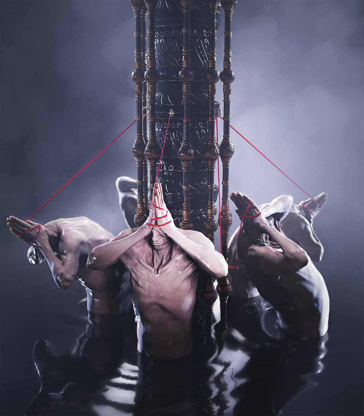
Artist Profile: Alex Ross


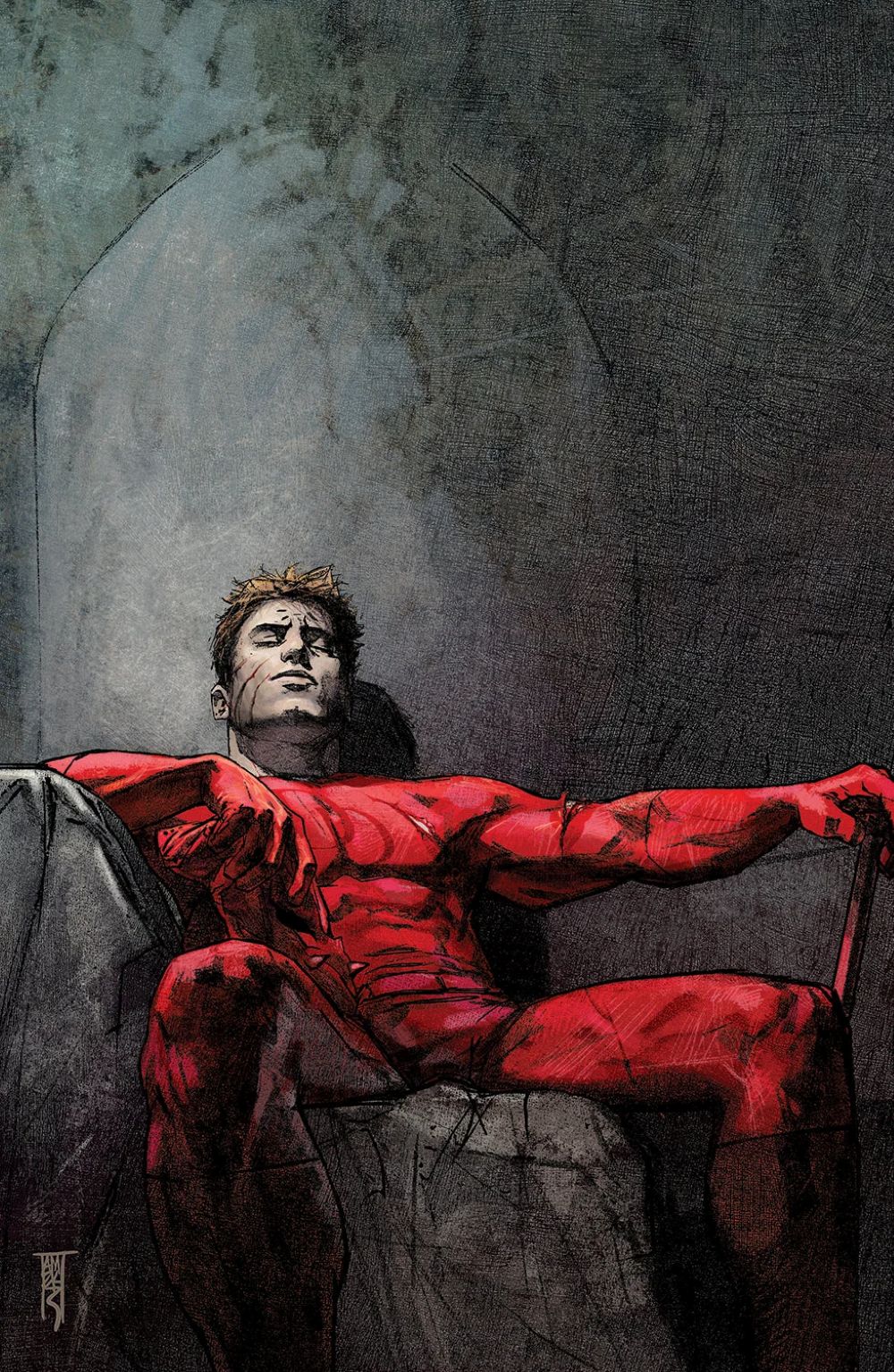
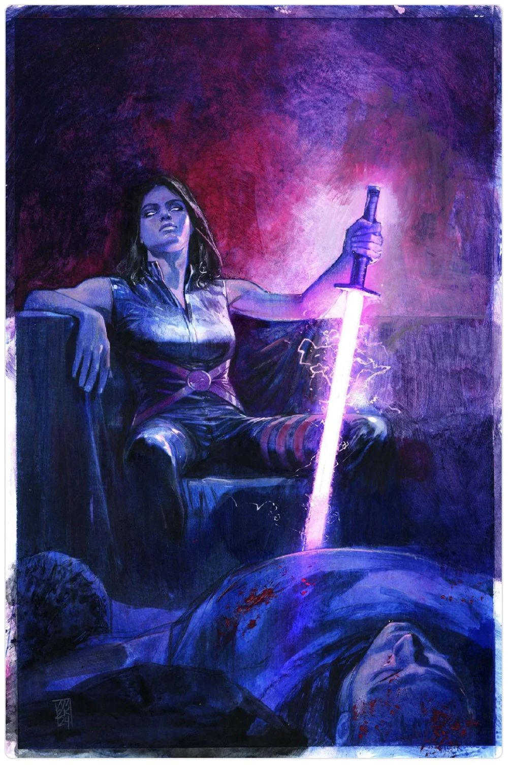
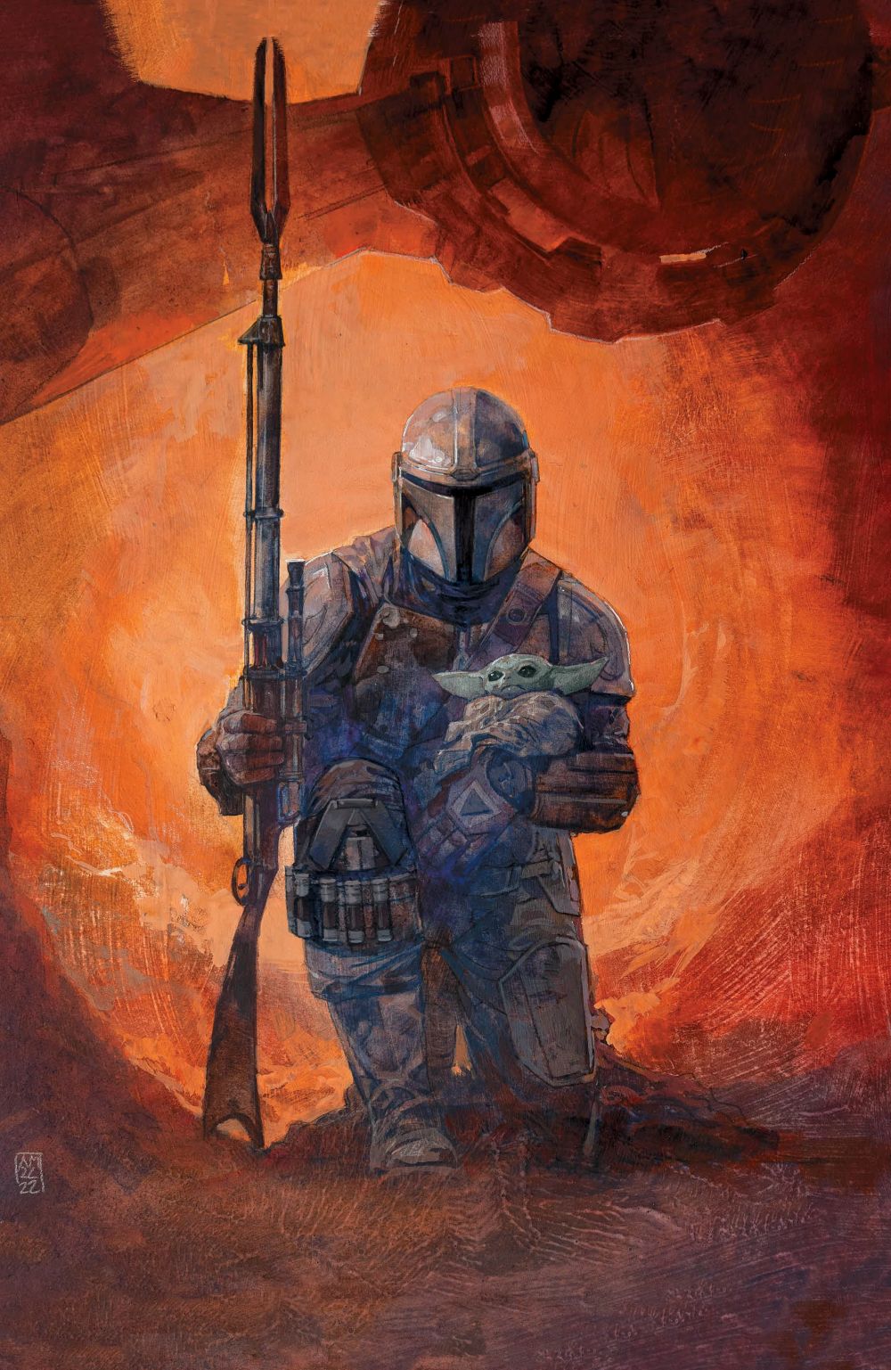
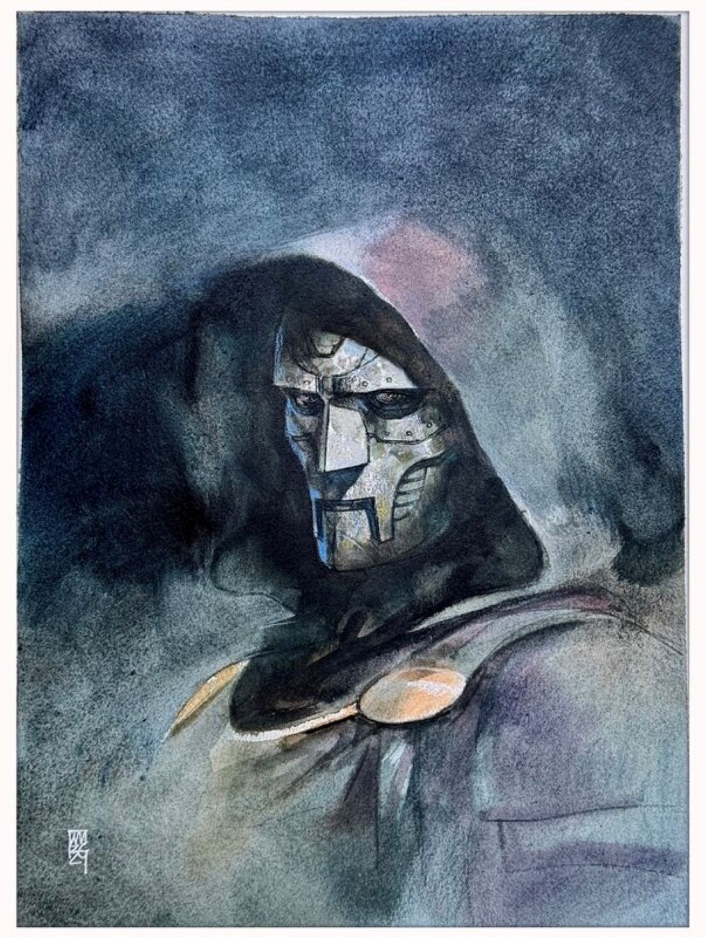
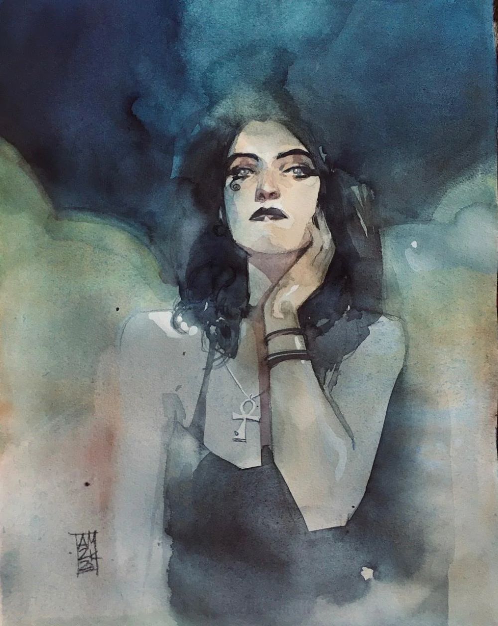
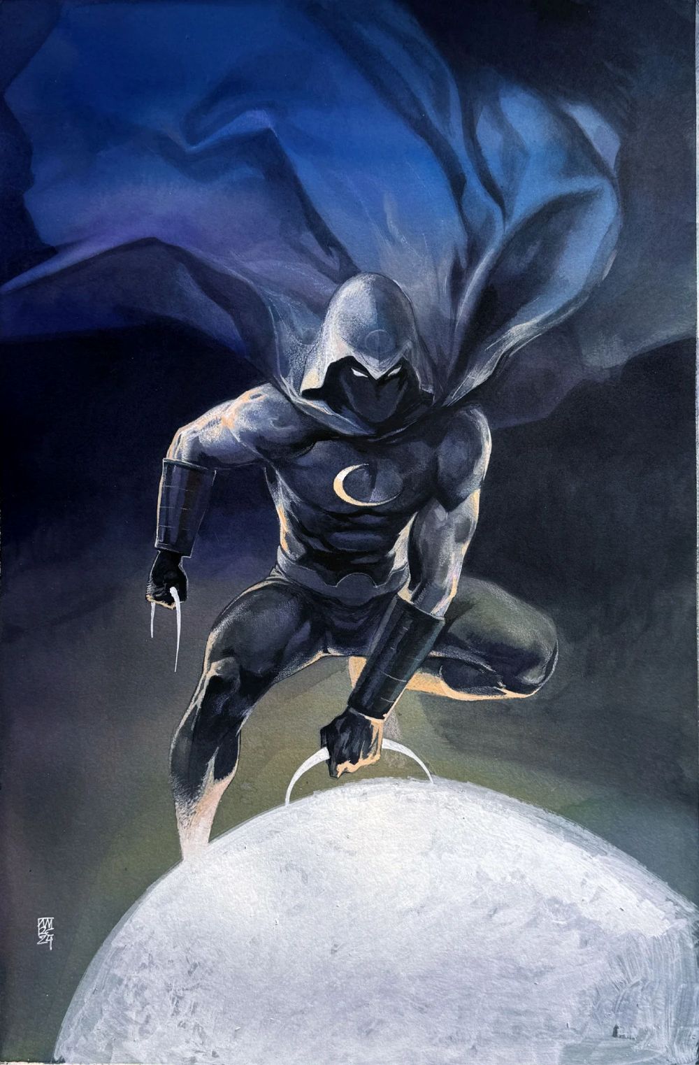
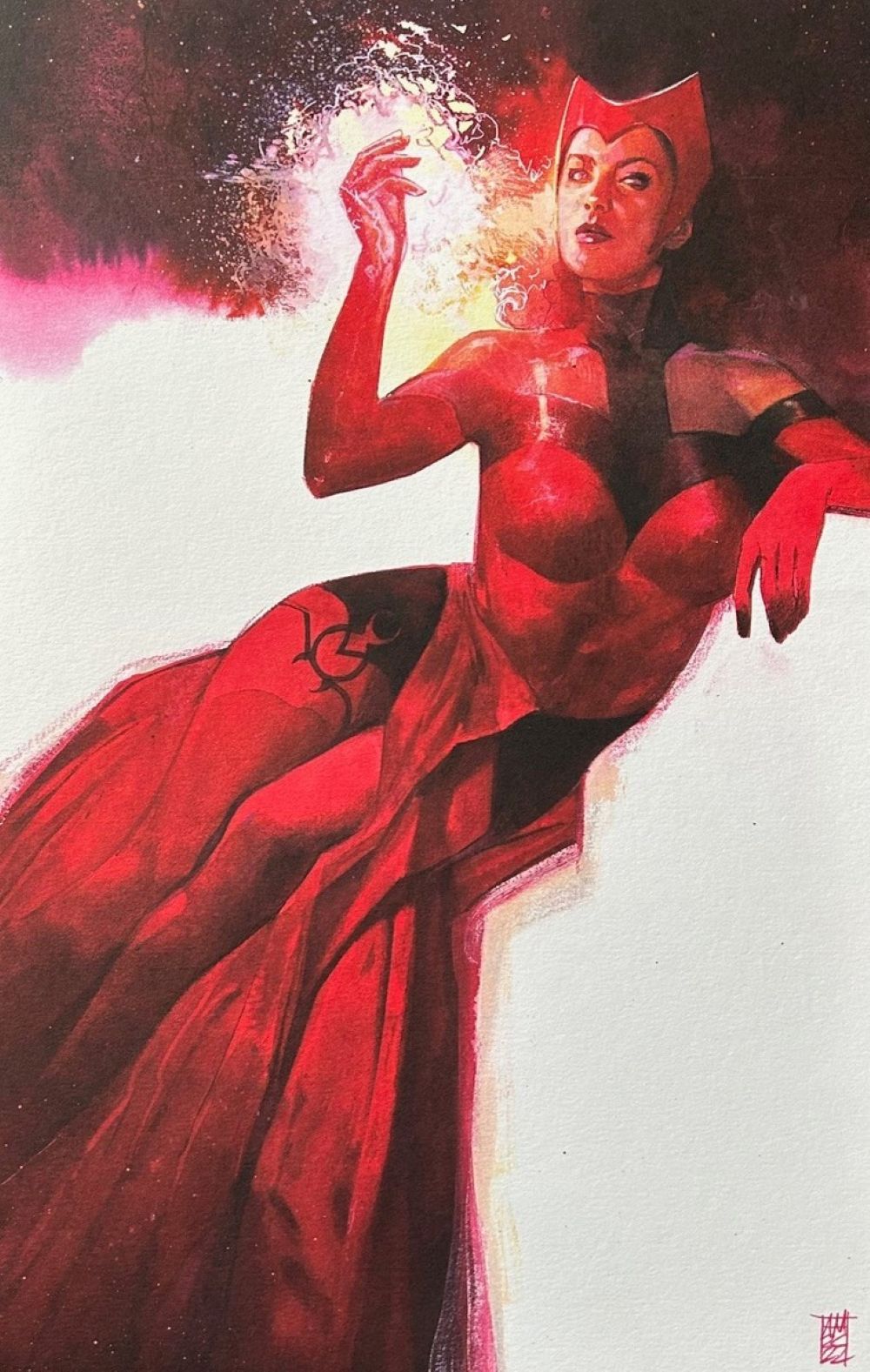
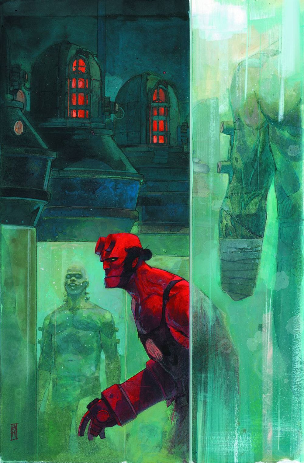
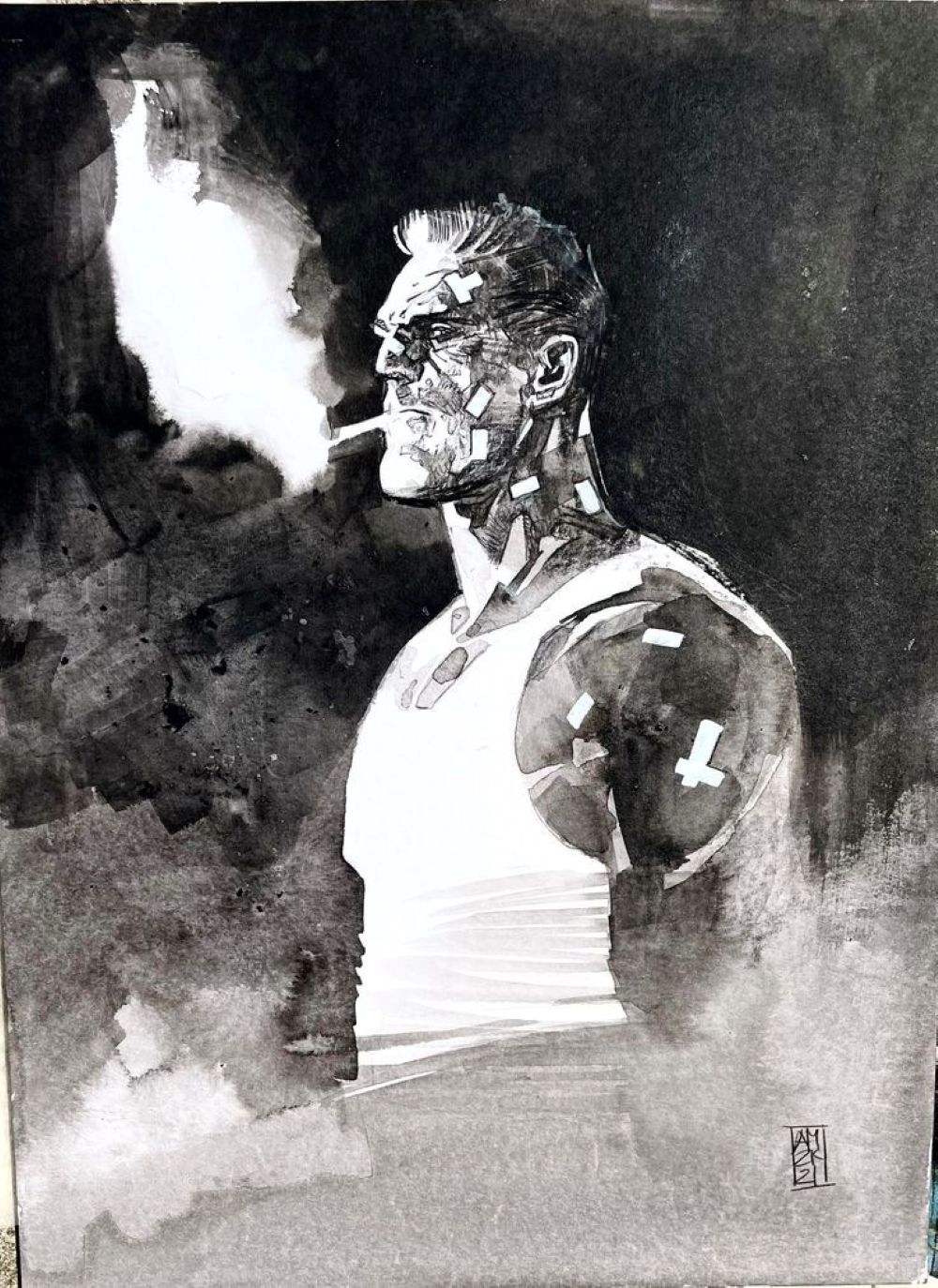
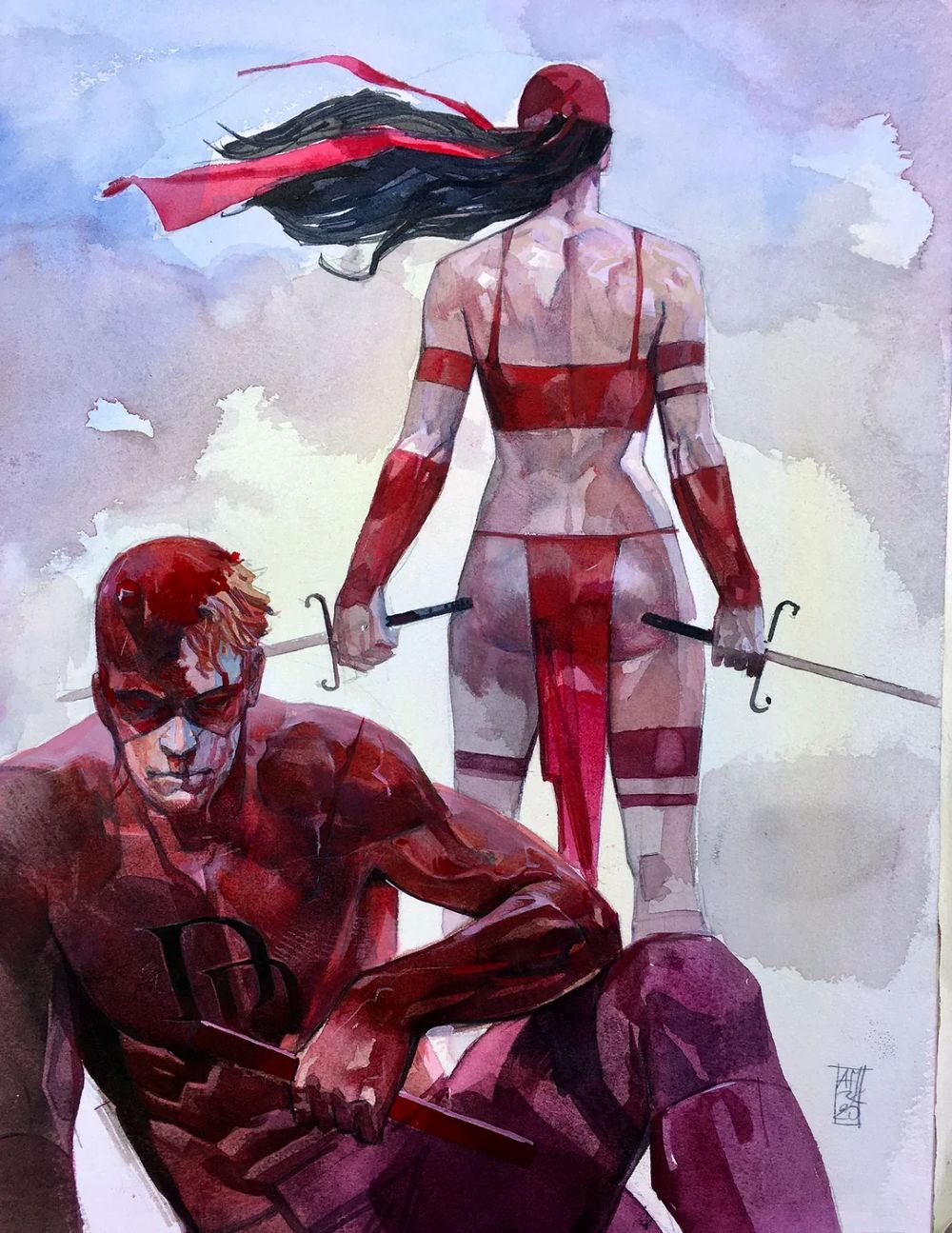
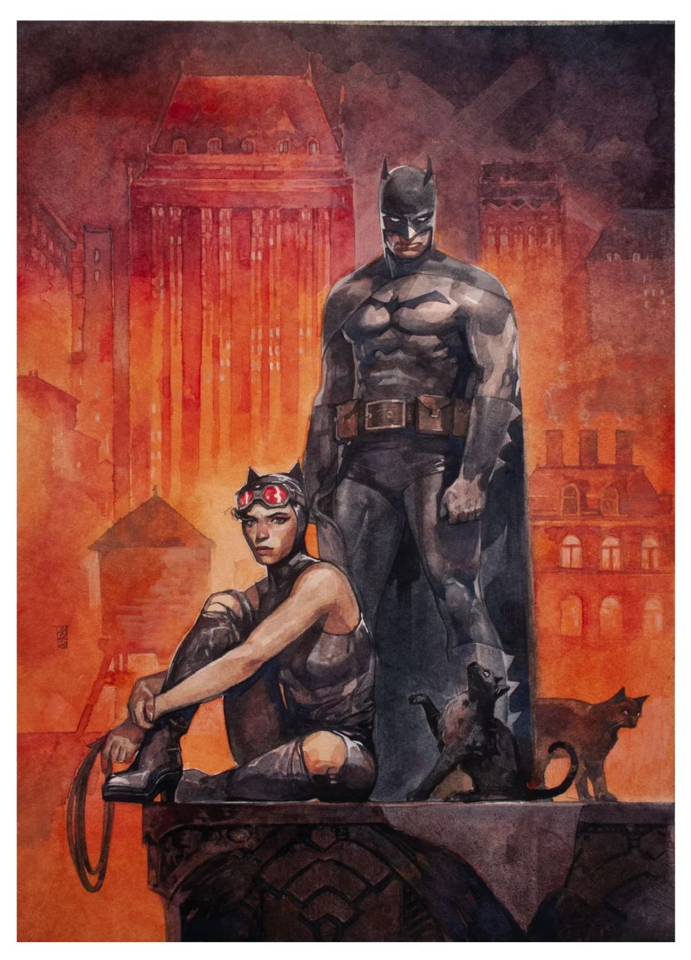
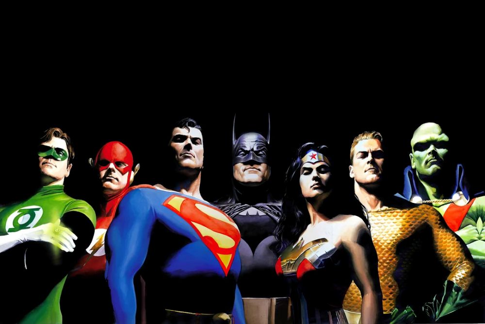
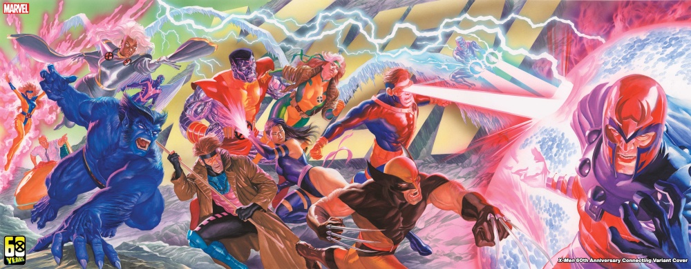
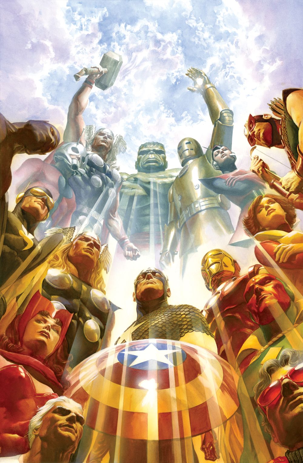
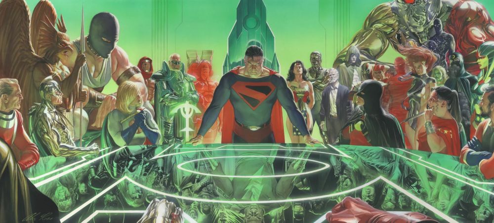
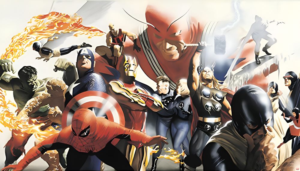
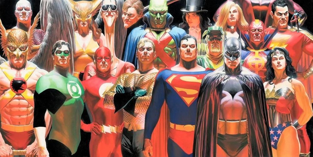
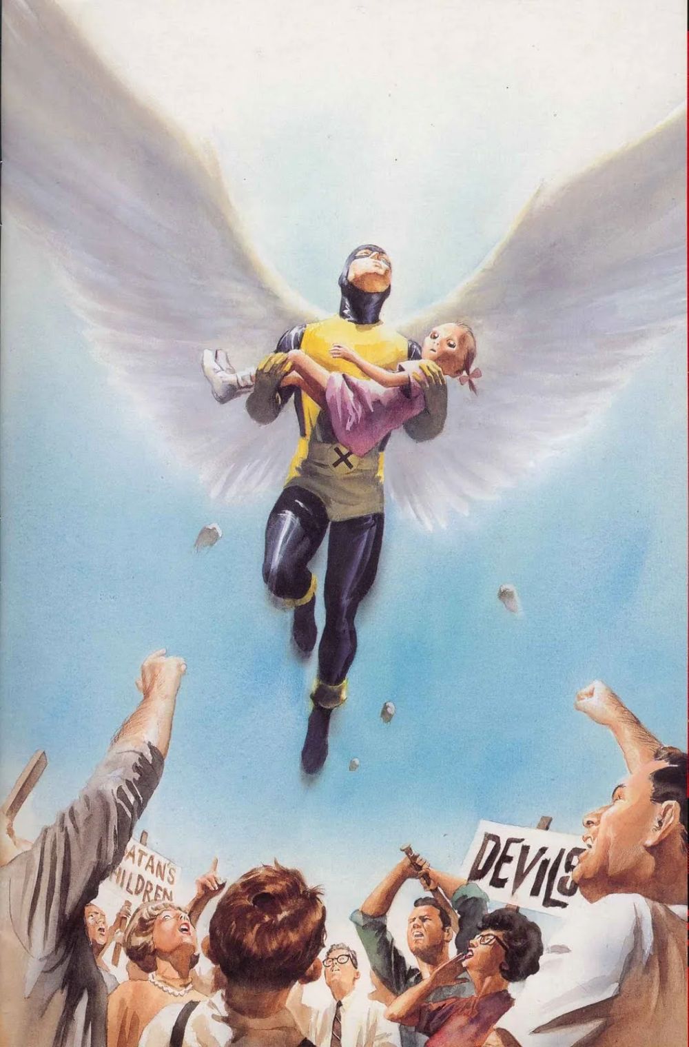
Alex Ross fundamentally transformed the visual language of American comic books by introducing a level of photorealistic fine art painting previously unseen in the medium. Eschewing traditional pen-and-ink line work, Ross utilized gouache, watercolor, and ink to render iconic superheroes with a tangible weight and texture that made them feel startlingly real. His approach treated comic book characters not as colorful abstractions, but as living, breathing figures existing in a recognizable world. By grounding these fantastical beings in reality through meticulous brushwork, realistic lighting, and lifelike facial expressions, Ross elevated the comic book cover and interior page to the status of gallery-worthy illustration, forever changing the expectations of comic book artistry.

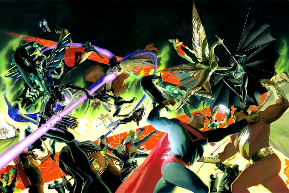
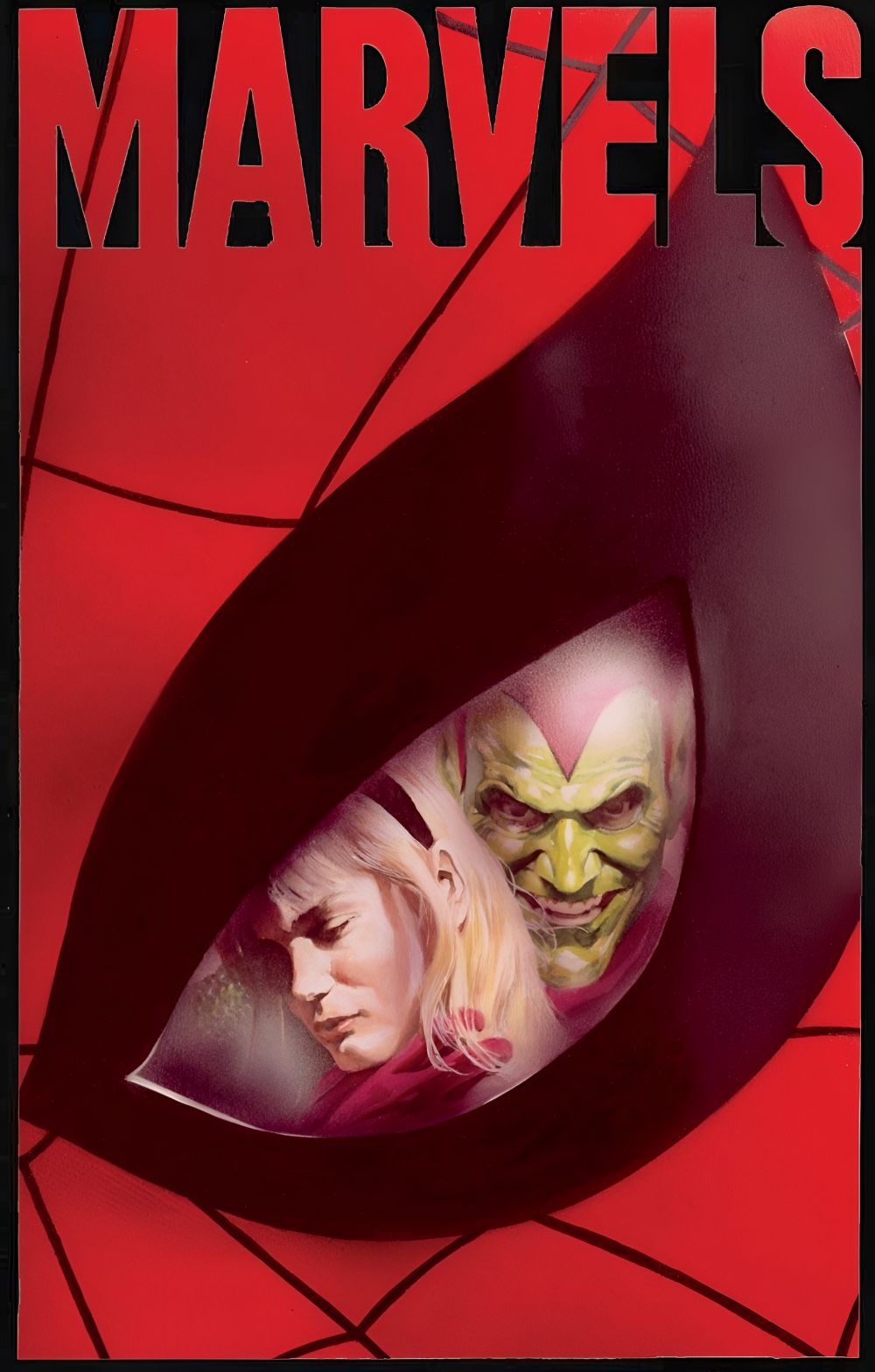
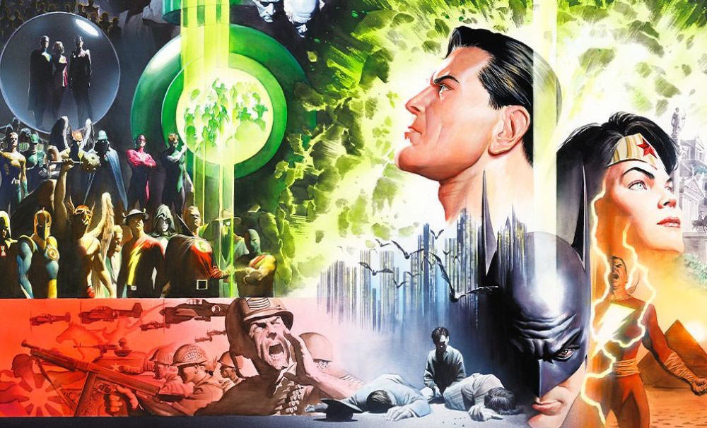
Ross’s impact is indelibly tied to his defining projects for the industry’s “Big Two” publishers. At Marvel Comics, his groundbreaking 1994 miniseries Marvels recontextualized the Golden and Silver Ages of the publisher’s universe through the weary eyes of an ordinary photojournalist, capturing the awe and terror of living alongside gods. He later expanded this sprawling mythos with the Earth X trilogy. However, it was at DC Comics where Ross arguably cemented his legacy. His 1996 magnum opus Kingdom Come offered a grand, prophetic, and deeply moral vision of the DC Universe’s future, utilizing his painted style to bridge the gap between the publisher’s Golden Age innocence and modern cynicism. Through works like Justice and Peace on Earth, Ross continually reimagined DC’s most famous characters, stripping away decades of dark reinterpretations to restore their fundamental nobility and mythic grandeur.
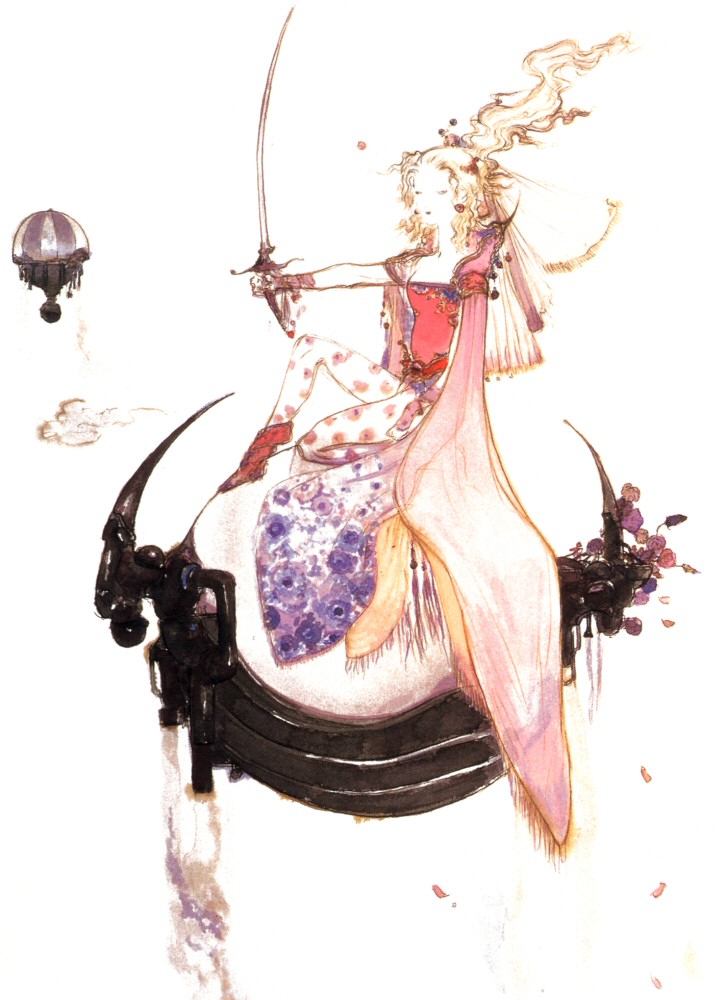
The legacy of Alex Ross extends far beyond the individual pages of his graphic novels; he essentially spawned an entire subgenre of painted comic book art that dominated the industry in the late twentieth century. While many imitators emerged attempting to replicate his style, few could match his nuanced understanding of color theory, historical costume design, and emotional resonance. Furthermore, his aesthetic influence has bled heavily into broader pop culture, with his conceptual character designs serving as direct visual inspiration for numerous animated television shows and live-action films. By proving that superhero mythology could be approached with the same gravitas and classical technique as Norman Rockwell’s illustrations or Renaissance portraiture, Ross forced the comic book industry to permanently expand its artistic boundaries.

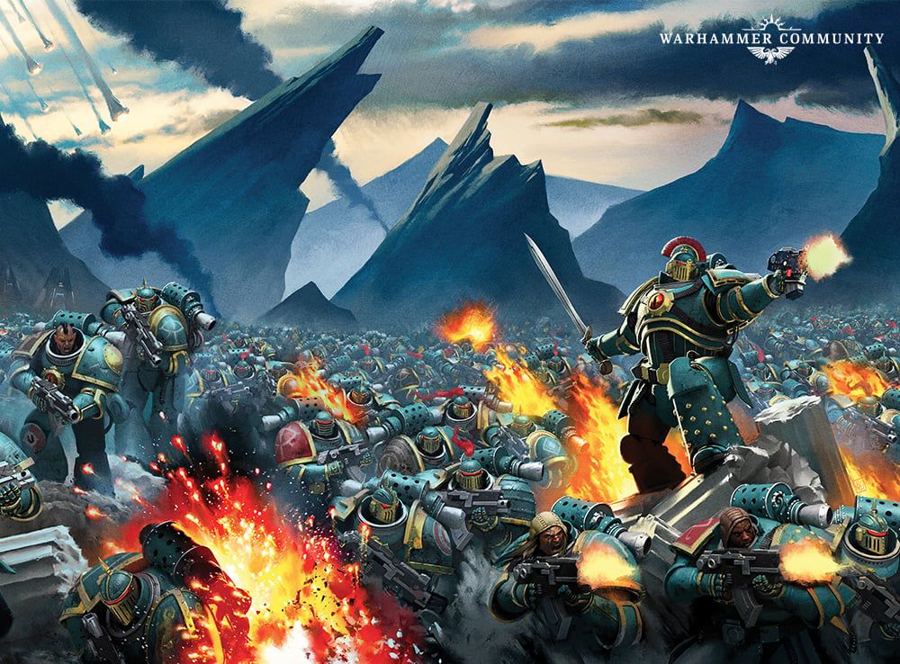
Artist Profile: Kunrong Yap (aka Krypt)


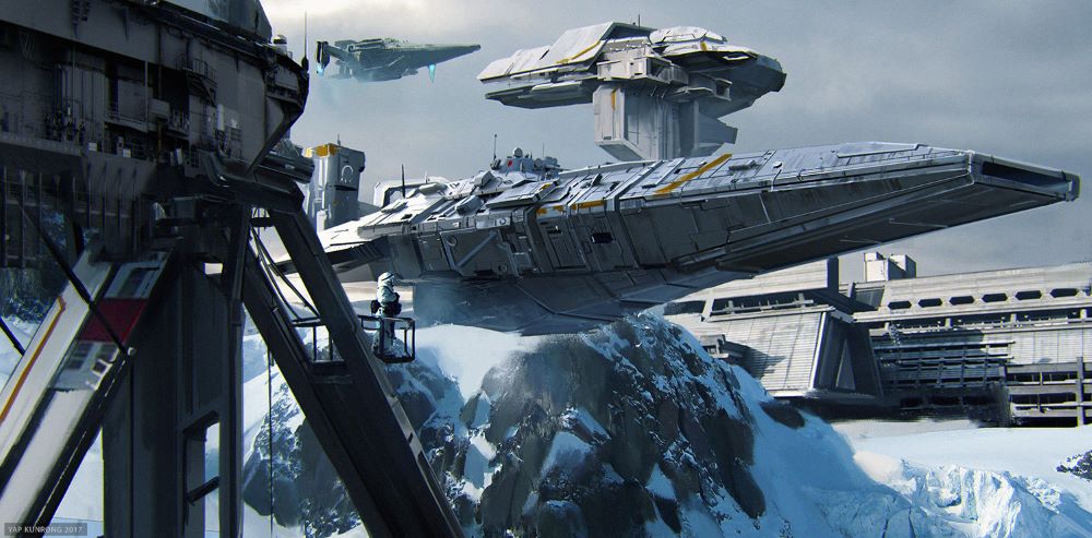
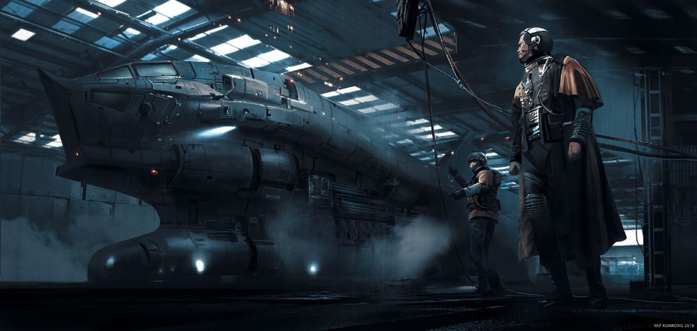
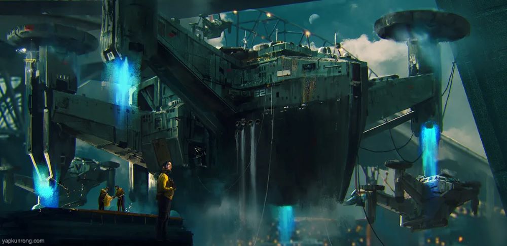
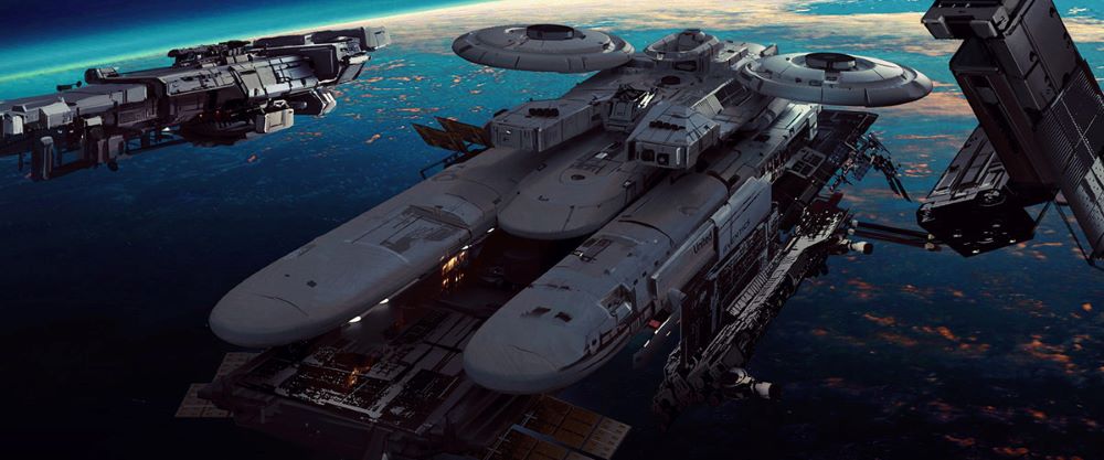
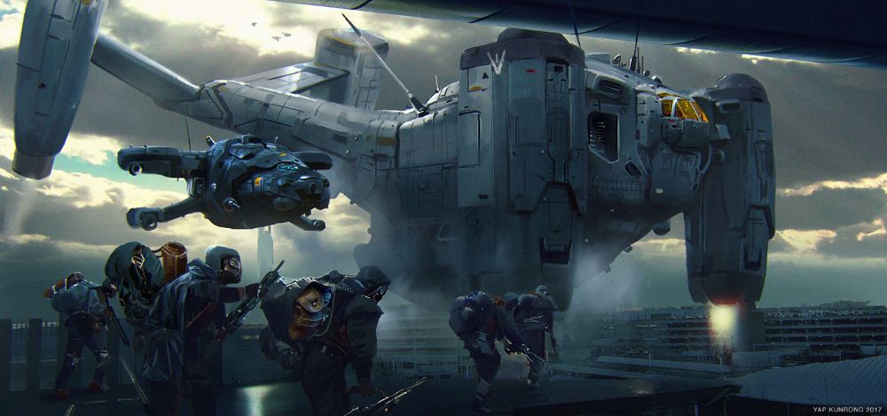
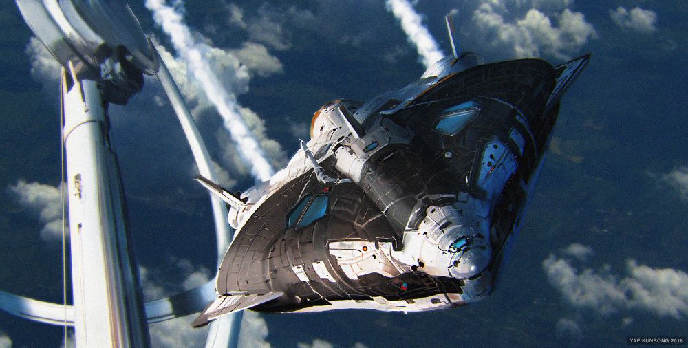
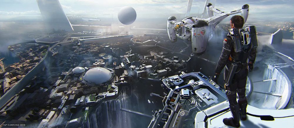
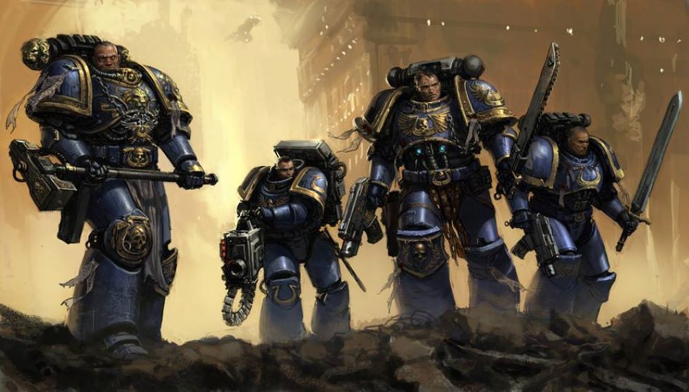
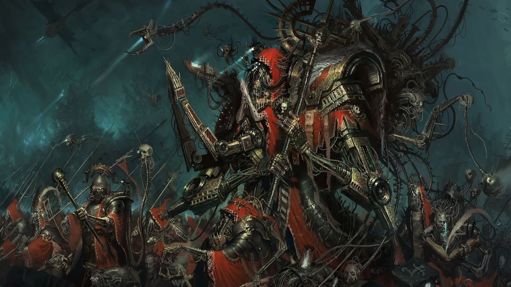
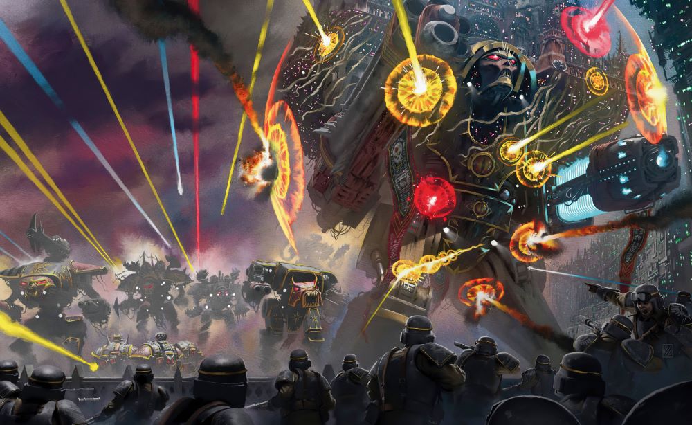
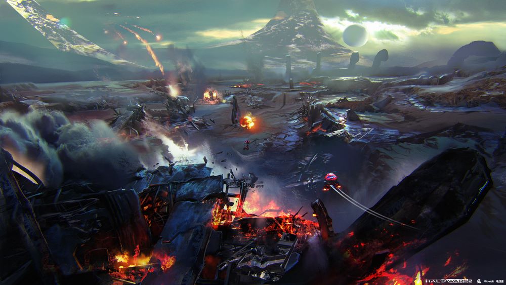
Kunrong Yap, aka Krypt, crafts sci-fi concept art that drops you into wild future worlds. His work shows off huge alien vistas, bio-mechanical mashups, and futuristic gear, all with sharp details in big layouts. Check out his portfolio at ArtStation (krypt.artstation.com).

He mixes tight digital skills with smooth organic touches, throwing in strong lights and chill atmospheres for that spooky space vibe. Cool blues, shiny metals, and faint fire pops build up with stacked textures and soft blends that feel real.

From Singapore roots and Tokyo days, Yap pulls in subtle Asian vibes and punchy Western film energy through bold angles and story-heavy designs for games and movies. It keeps his range wide with a solid cyberpunk kick.

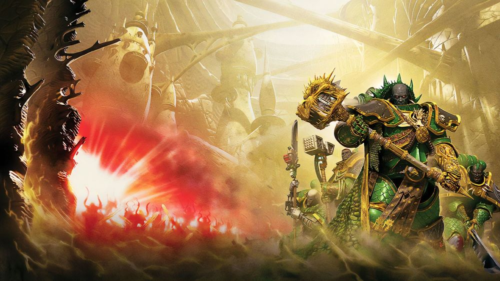
Artist Profile: Karl Kopinsky


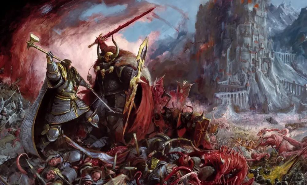
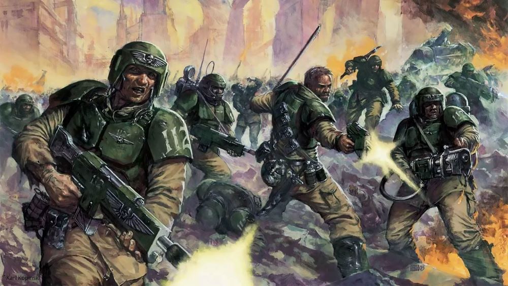
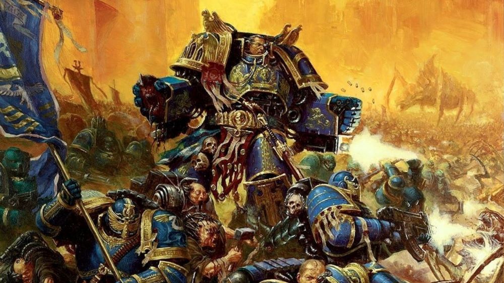
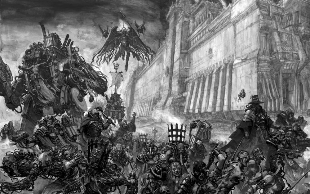
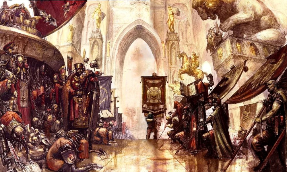
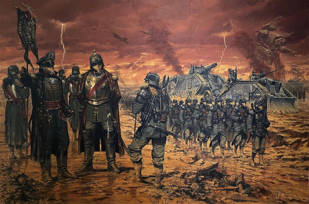
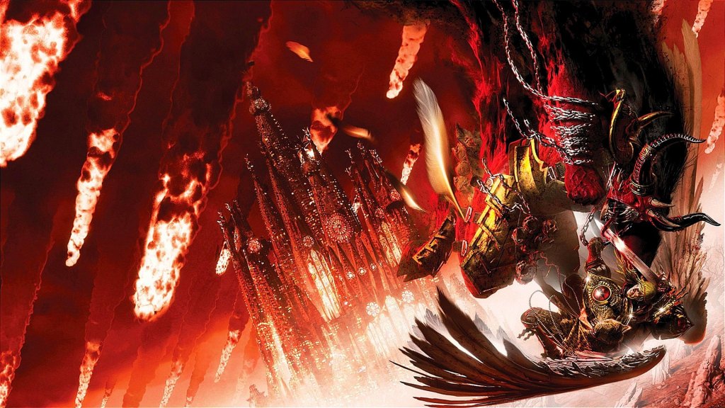
Karl Kopinski is well-known for his powerful and vivid artwork within the Warhammer 40,000 and Warhammer Fantasy universes. His illustrations bring to life the dark and intense atmosphere of these worlds, combining detailed pencil sketches with digital painting techniques. Kopinski’s art captures the ruggedness and drama of the characters and environments, giving fans a strong visual connection to the stories and miniature figures. His early work with Games Workshop helped establish the distinctive look and feel that many associate with the Warhammer brand.

In his Warhammer 40K pieces, Kopinski focuses on dynamic characters and battle scenes that feel full of energy and history. From armored soldiers to monstrous creatures, his work emphasizes strong contrasts and vivid expression, creating images that suggest an ongoing saga of conflict and heroism. Similarly, his fantasy art conveys mythical themes with a fresh, raw energy, balancing realism with imaginative design. His style invites both players and artists to immerse themselves in the rich narratives of these fantasy worlds while inspiring miniature hobbyists who recreate his detailed designs.

Beyond his contributions to Warhammer, Kopinski continues to explore fantasy art through various projects, blending realistic anatomy and dramatic light with creative storytelling. His illustrations stand out for their ability to mix traditional drawing techniques with modern digital tools, offering a unique and compelling look that appeals to a broad audience.

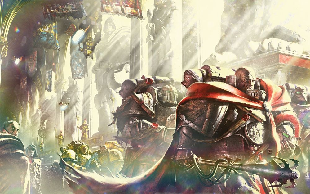
Artist Profile: Neil Roberts


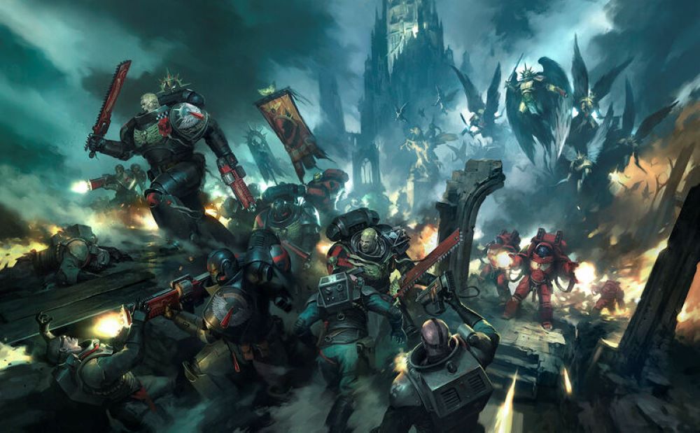
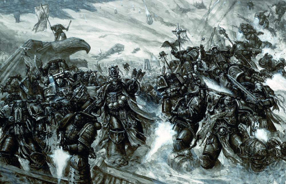
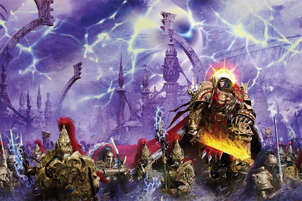
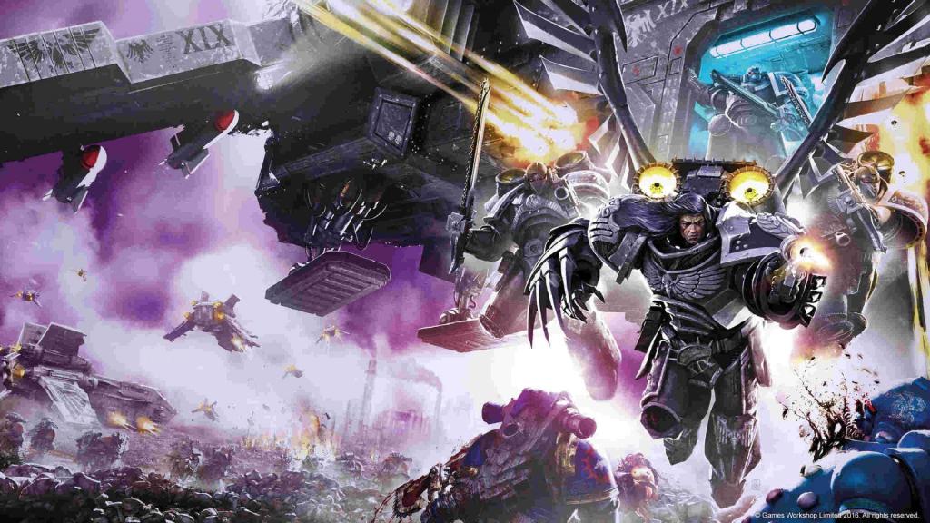
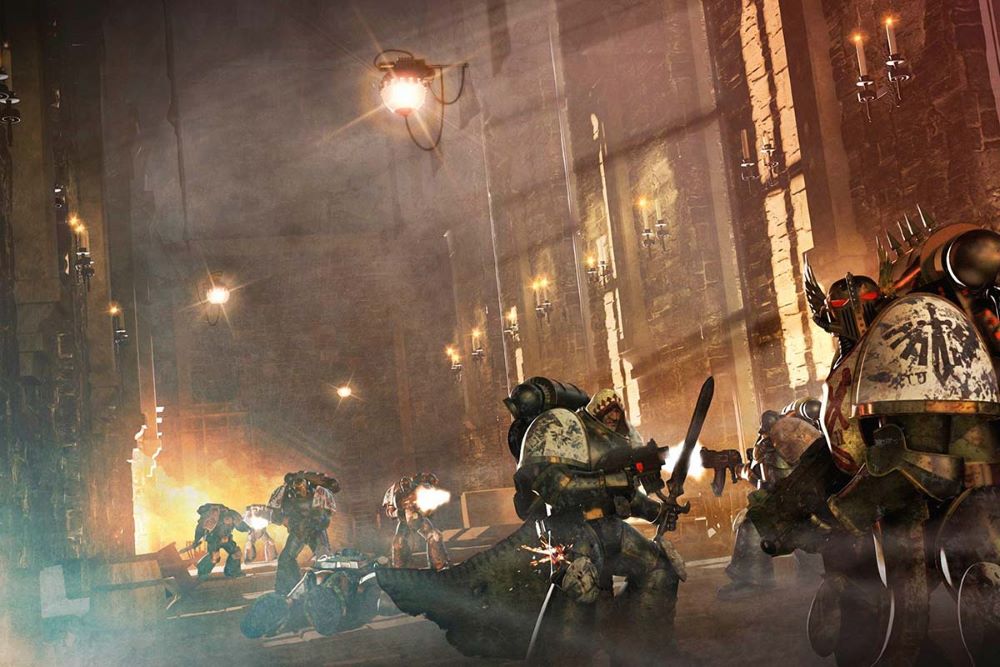
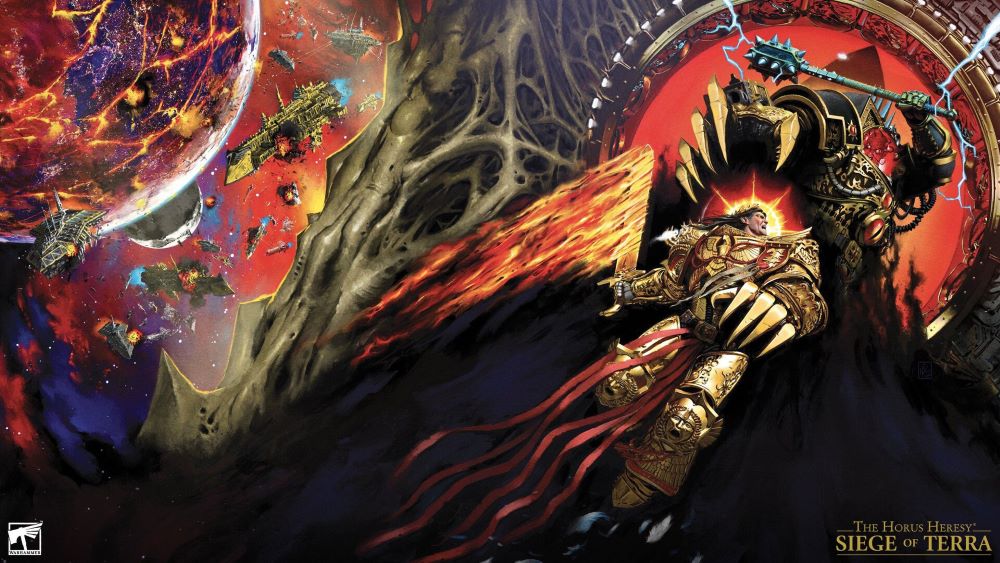
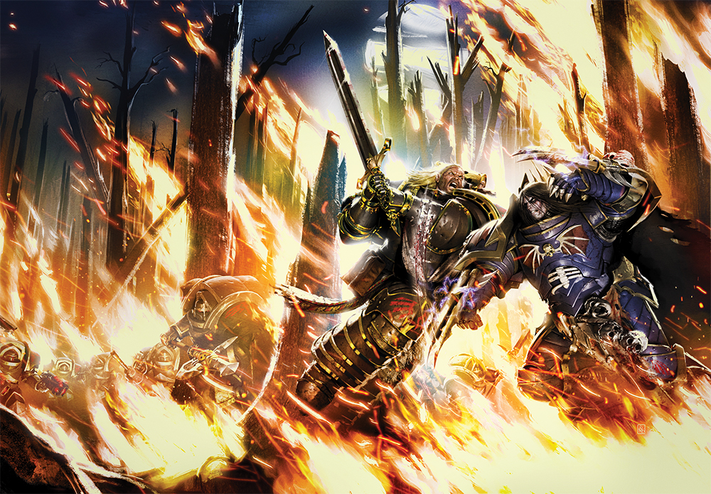
Neil Roberts has a knack for bringing the dark, brutal world of Warhammer 40K’s Horus Heresy to life with his cover art. His paintings do an amazing job of showing the grim and epic atmosphere that defines the setting — filled with shadows, war-torn armor, and a sense of endless struggle. The moody lighting and intense detail in his work really pull you into a universe that feels both vast and oppressive, perfectly matching the tone of the stories inside.

What makes his art stand out is how he captures that feeling of dread mixed with heroism. His Space Marines and iconic characters aren’t just soldiers; they’re larger-than-life figures bathed in harsh light and surrounded by chaos, which really nails the “grim darkness” aspect Warhammer fans expect. Every cover looks like a scene from a massive battle where hope is scarce, but courage burns bright—which is exactly how the Horus Heresy saga plays out.

Roberts’ style balances digital polish with a painterly touch, giving his art depth and life without losing the hand-crafted vibe. This approach makes the scenes feel immersive, like a visual gateway to the brutal and tragic history of the Imperium. For fans, his covers aren’t just illustrations; they’re essential to experiencing the full weight of the Warhammer 40K universe’s darkest moments.

Horror Artist Profile: Ben Templesmith


BEN TEMPLESMITH

Ben Templesmith 07

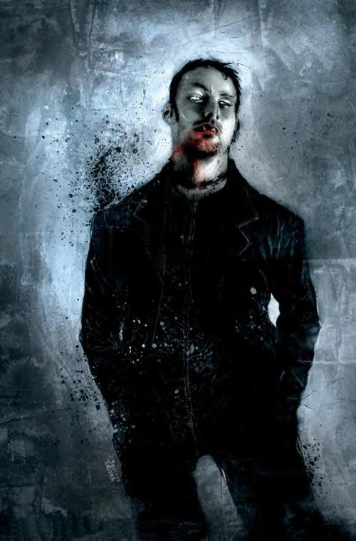
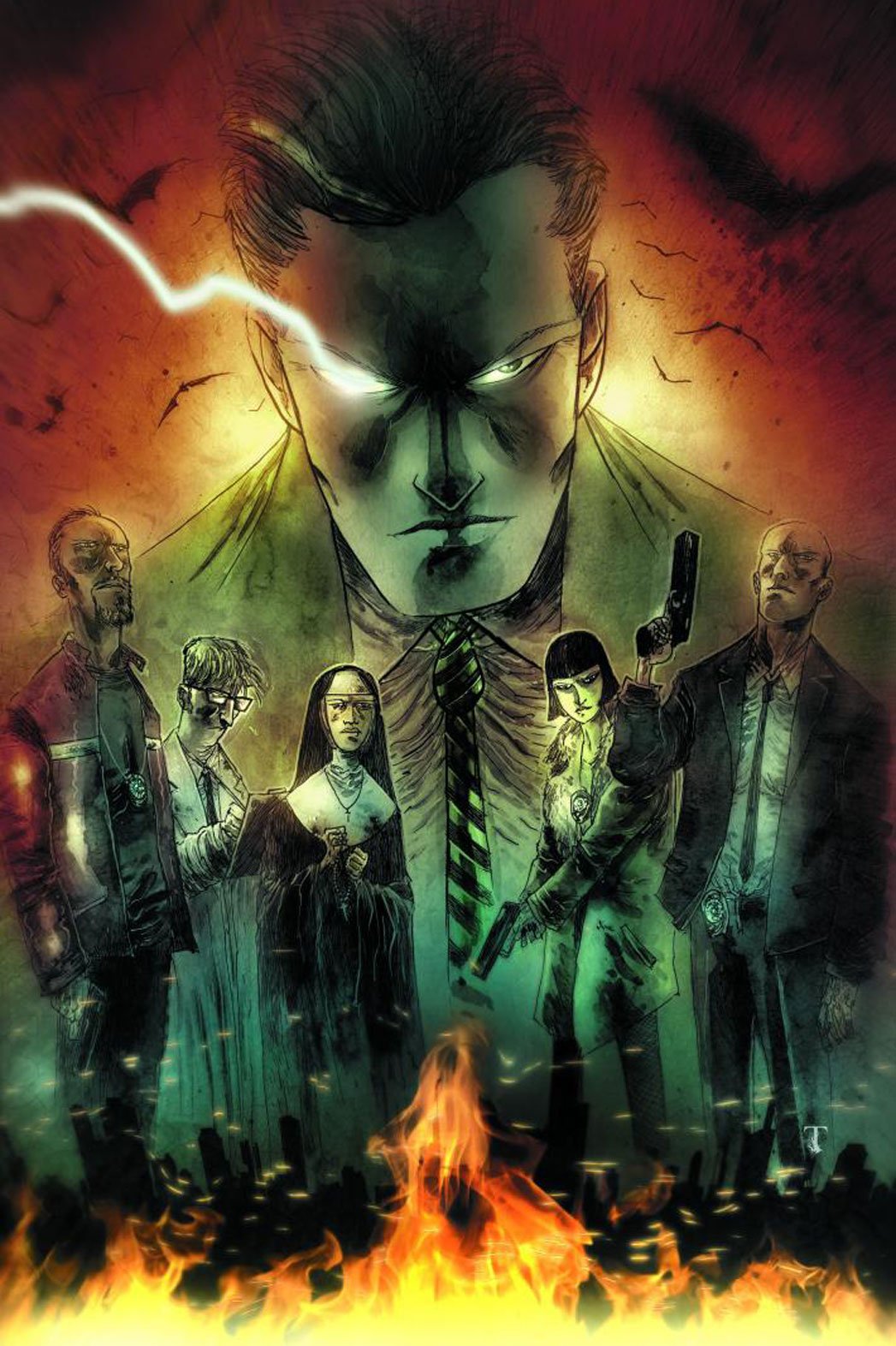
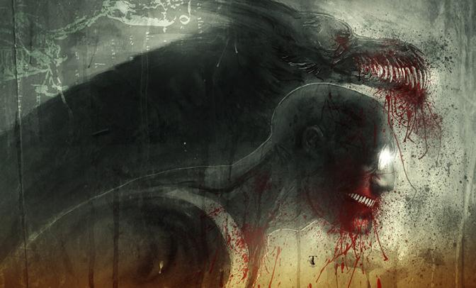
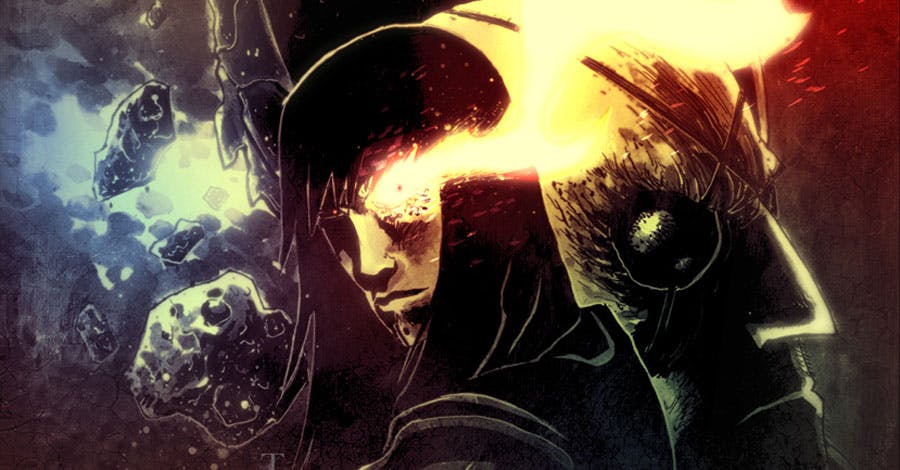
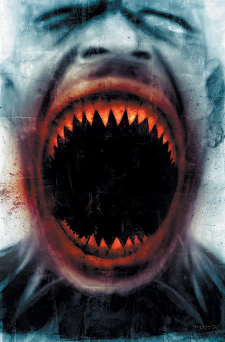
Ben Templesmith has been one of the more interesting artists when it came to horror comics or, at the very least, when going for a more horror-themed cover. He has done cover work for comic publishers like IDW, Image comics and lately for DC Comics.

Born on Match 4, 1984 in Perth, Australia, Ben Templesmith like most comic artist would get his start working on a degree in graphic art and design which he would use to begin work as early as 2002 doing cover work for Todd McFarlane’s Hellspawn series. This would be the beginning of what would be a career of doing work for the large indie comic publisher Image Comics.

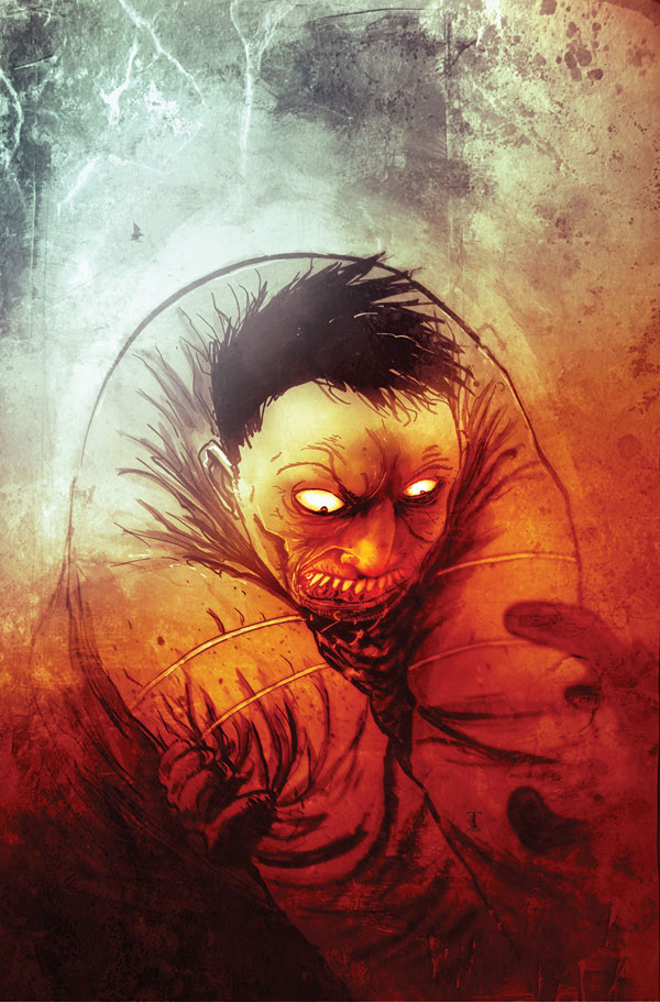
Yet, it would be the cover and interior artwork that he creates for Steve Niles’ 30 Days of Night horror franchise over at IDW Publishing that would be his claim to fame. His covers for the main series and the off-shoots would lead to more personal horror works such as Welcome to Hoxford, Wormwood: Gentleman Corpse and Choker.

Ben Templesmith has a unique rough-hewn style that’s both disturbing and beautiful and brings to mind a dreamlike (or nightmarish depending on one’s predilection) and surrealistic style. It’s no wonder his style has become very synonymous with modern horror comic art.
Ben Templesmith 02Ben Templesmith 03Ben Templesmith 04Ben Templesmith 05Ben Templesmith 06Ben Templesmith 08Ben Templesmith 09

Horror Artist Profile: Bernie Wrightson (1948- )


BerniWrightson01

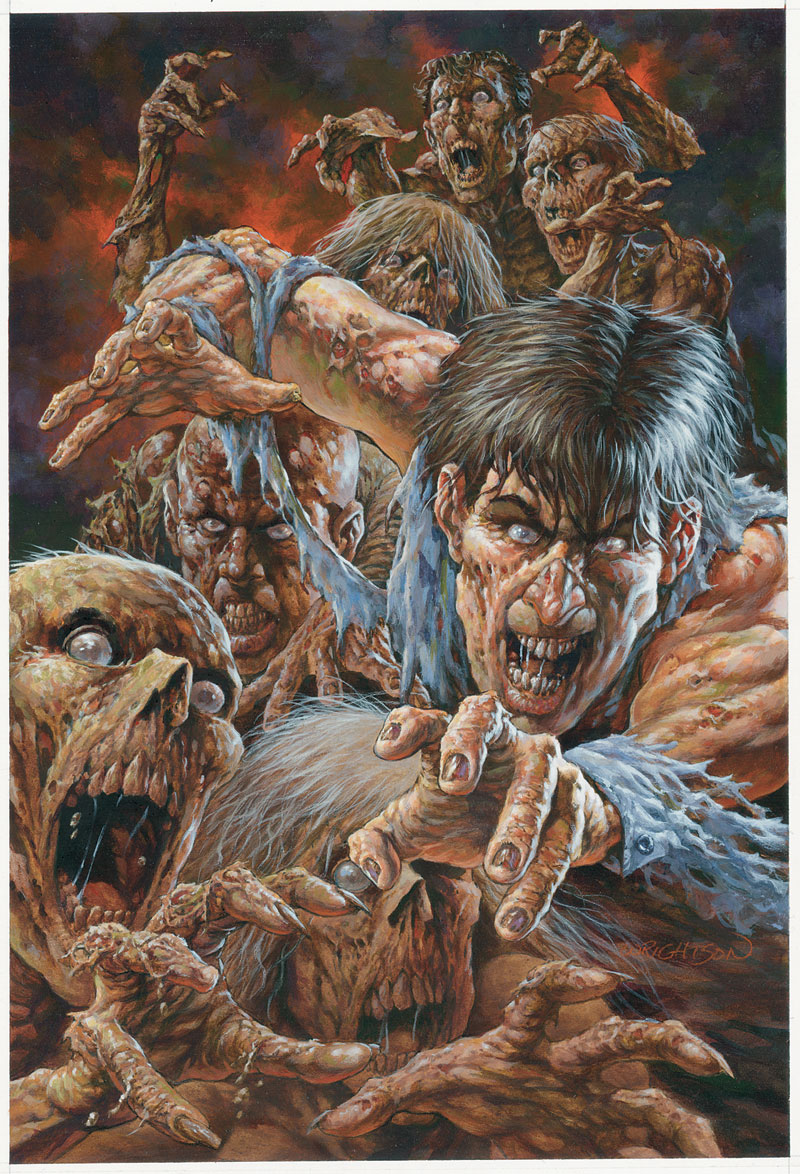
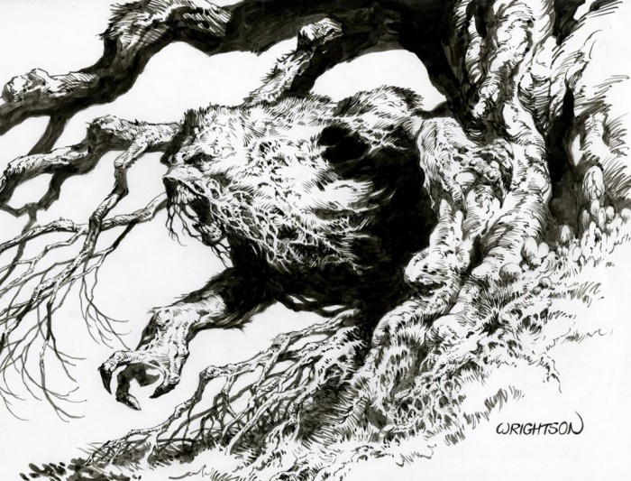
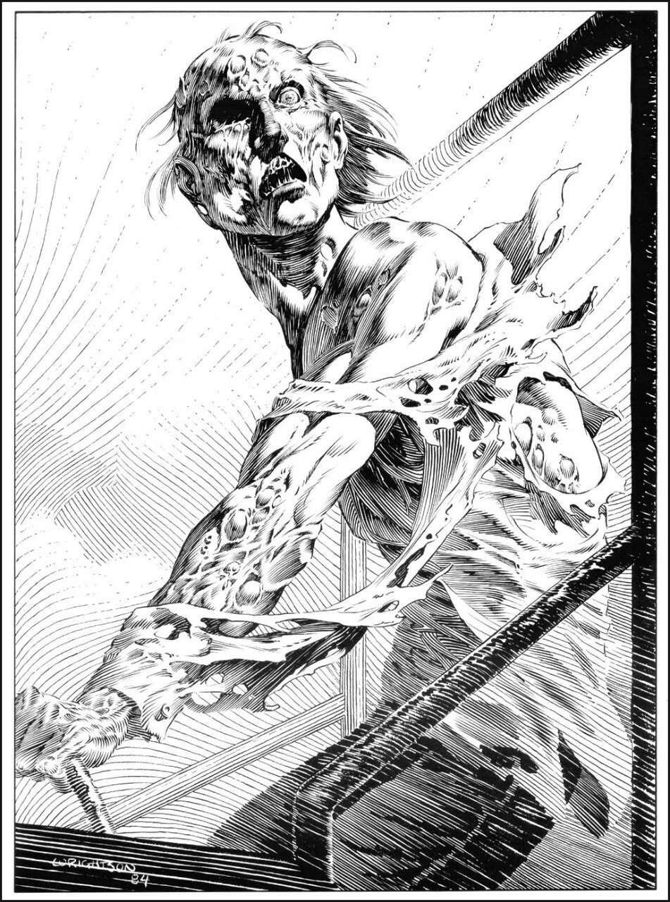
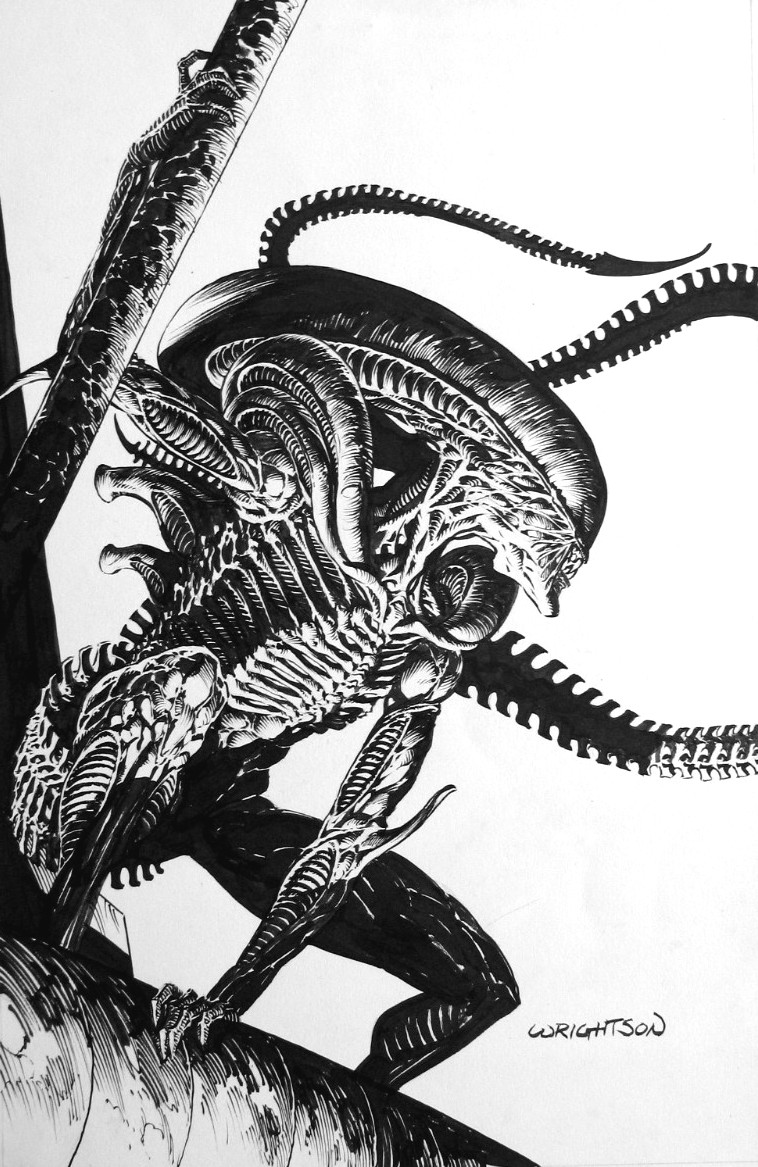
Horror fans know who Bernie Wrightson is even if not by name, but by the work he has done in the horror field.

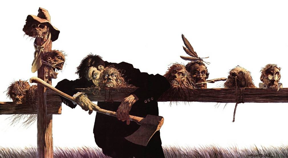
Born in October 27, 1948, Bernie Wrightson has made his name creating some of the more recognizable horror illustrations since the 1970’s. Wrightson would have his break out work in conjunction with Len Wein in co-creating the character Swamp Thing for DC Comics in 1971. In time, Wrightson would move on from DC Comics and the character he created for Warren Publishing that were well-known for producing black-and-white horror titles.

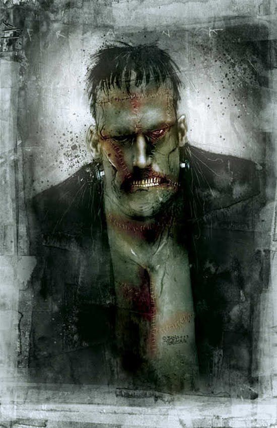
Throughout the years, Wrightson would end up producing some classic images for horror stories ranging from Mary Shelley’s novel Frankenstein right up to several Stephen King novels (The Stand, Cycle of the Werewolf and Wolves of the Calla).

Here’s to hoping that Wrightson has many more years of horror work ready to fire up the imaginations of horror fans everywhere.

BernieWrightson02

BernieWrightson03

BernieWrightson05

BernieWrightson06

BernieWrightson07

BernieWrightson08

BernieWrightson09

BernieWrightson04

Artist Profile: Hyung-tae Kim (1978 — )


HtK00

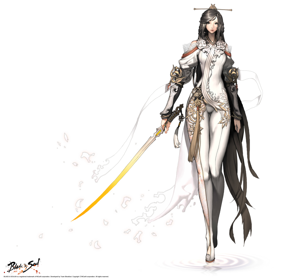
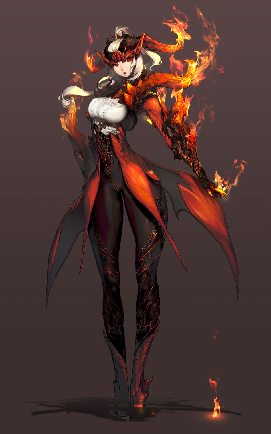
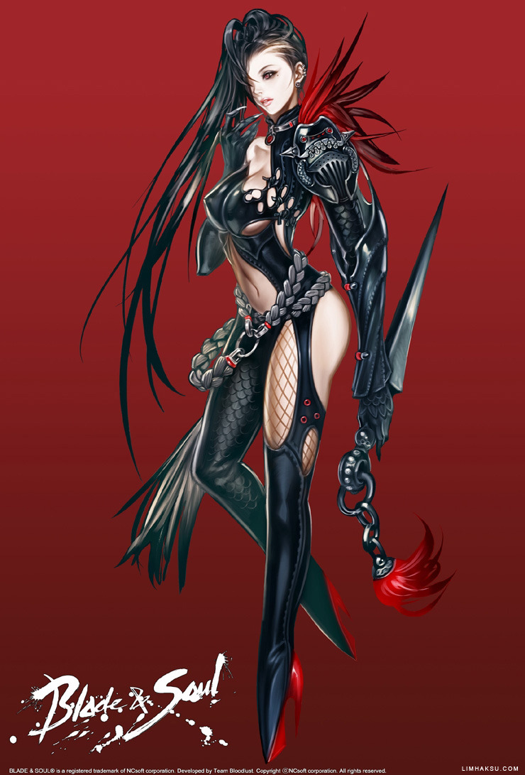
Korean manwha artist and illustrator Hyung-tae Kim has become famous for his video game illustrator and art design work.

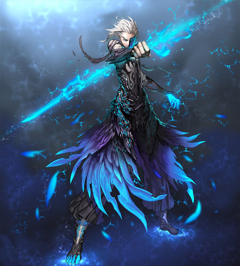
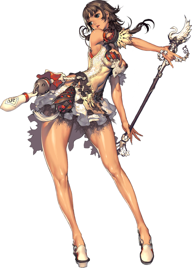
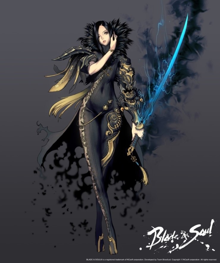
Born in February 1978 in Seoul, South Korea, Kim began his career in the video game industry creating background music for games, but he soon moved on to the art and design phase of the game process. His most notable works has been the covers and art design for the console rpg series Magna Carta and the Korean mmorpg title Blade & Soul for software studio NCSoft.

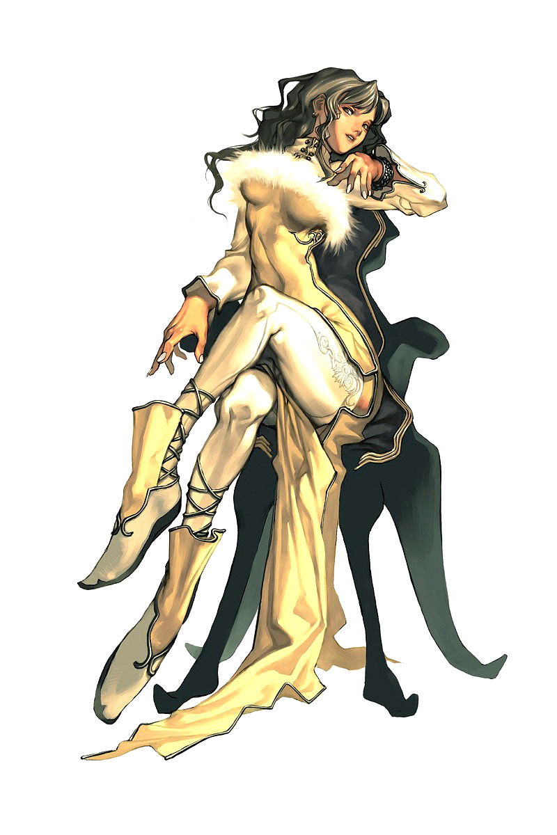
His style of artwork has been described as anatomically incorrect which is true, but he uses this deformation technique as a way to allow the unique individual personalities of each character to come out through the design. The unique look of his artwork has made his art books and art pieces highly sought after (both of which are very limited in nature) once they come out and then afterwards in secondary collectible markets.

HtK01

HtK10

HtK02

HtK09

HtK03

HtK08

HtK04

HtK05

HtK06

HtK07

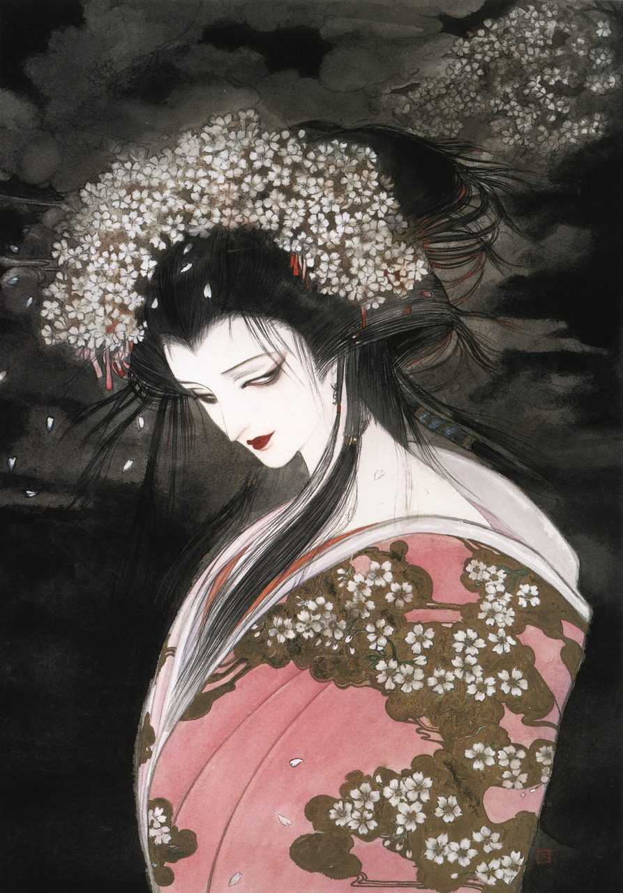
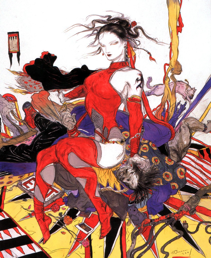
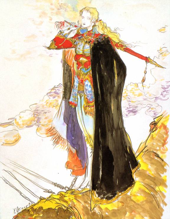
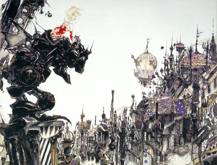
Artist Profile: Yoshitaka Amano


YoshitakaAmano01

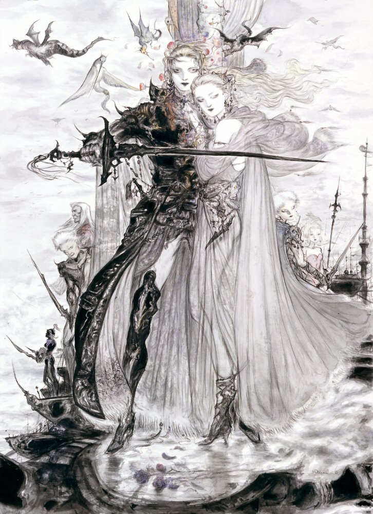
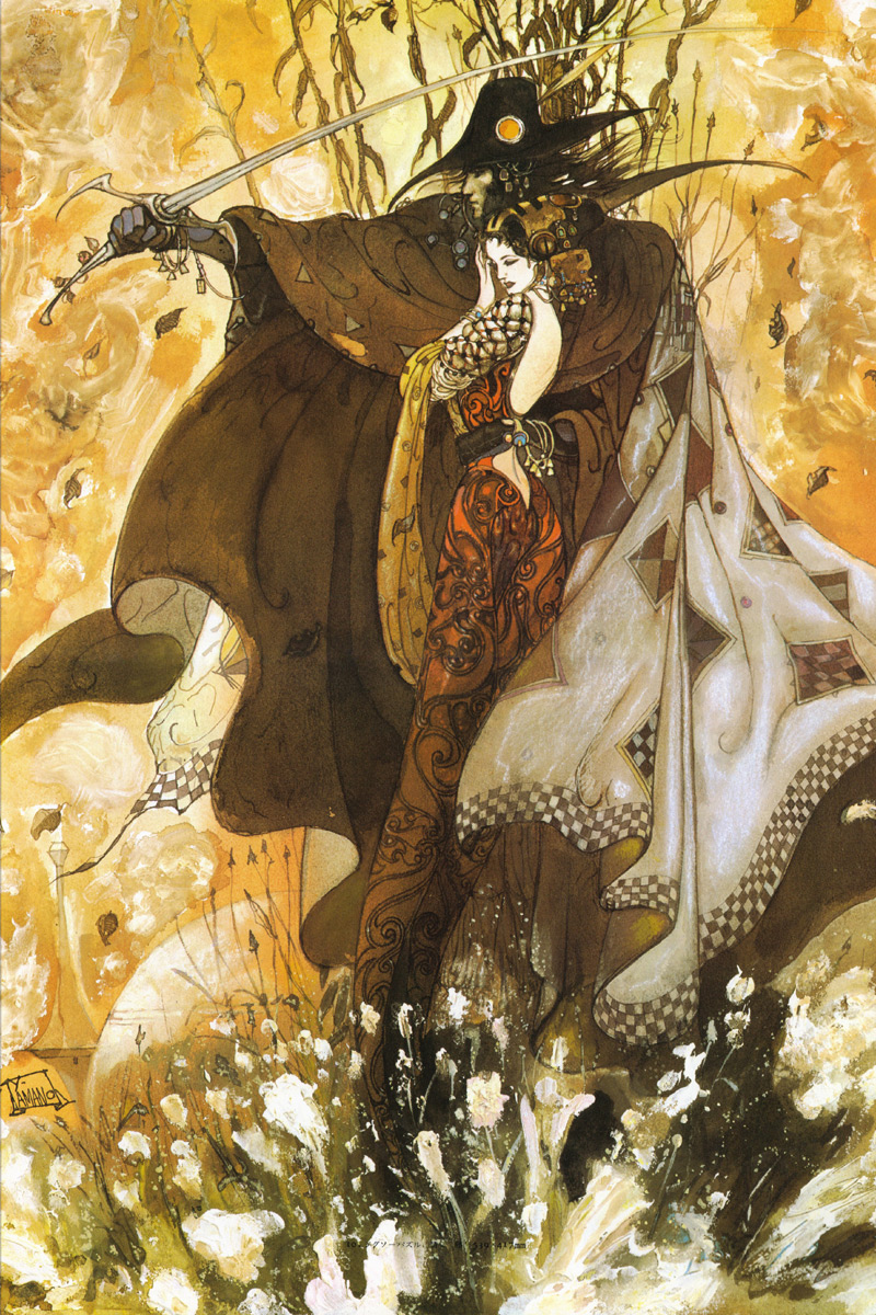
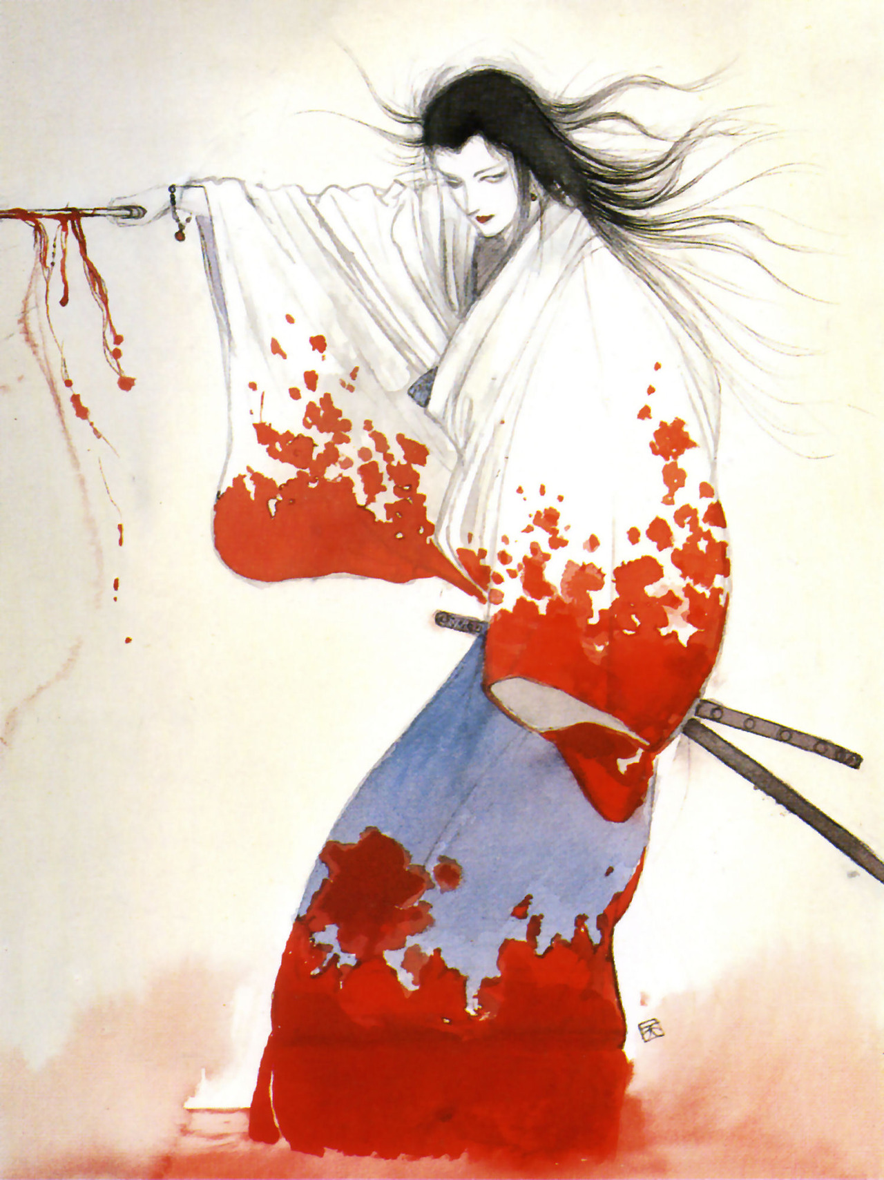
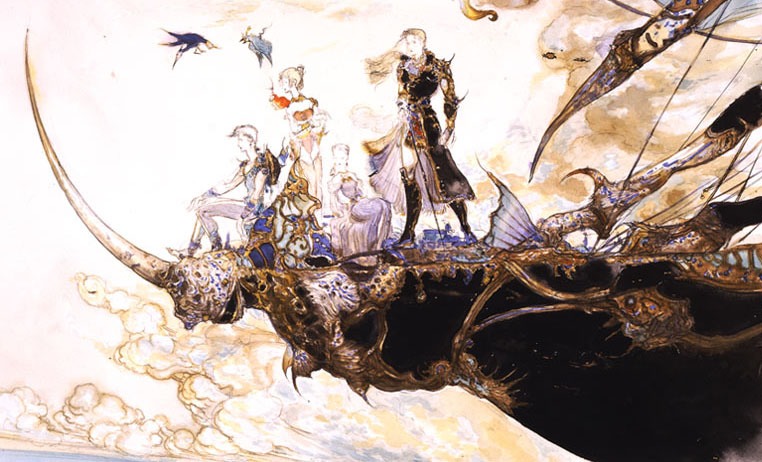
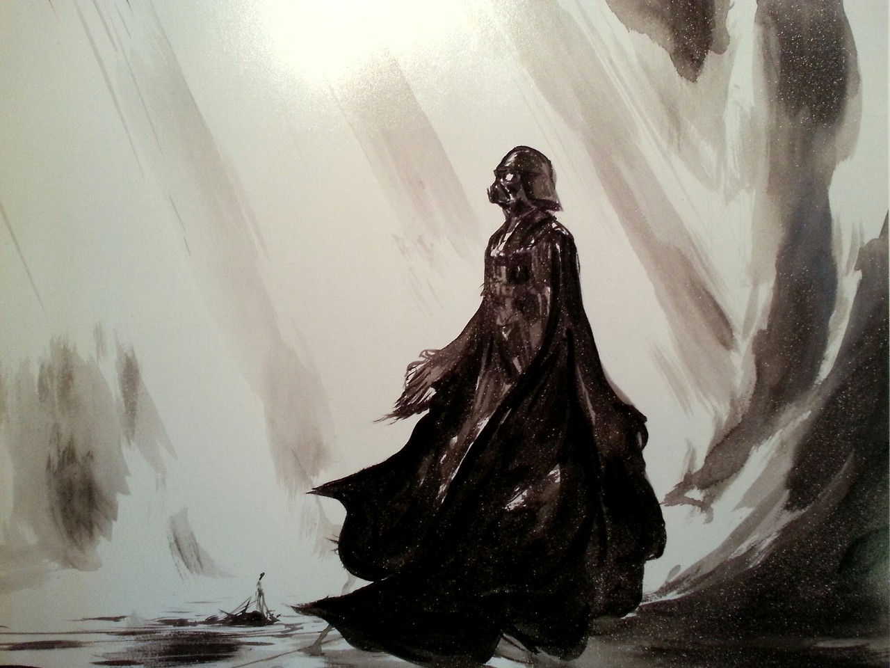
Yoshitaka Amano, born 1952 in Shizuka, Japan, is one of Japan’s most-renowned artists and illustrators. He also began his career as a character designer for early anime shows like Speed Racer, Gatchaman and Tekkaman. He would continue to build on his portfolio of unique character designs for anime, video game franchises and Japanese pop culture art.

Amano-san has pointed out Western artists such as comic book artist Neal Adams as an inspiration in his own style which when combined with his knowledge and appreciation of the classic Japanese hard woodblock printing known as Ukiyo-e would lead to one of the most unique character styles in mainstream pop-culture.

Yet, Amano-san will forever be known for and continues to be popular for his work in helping design the characters for the the video game rpg franchise known the world over as Final Fantasy.

YoshitakaAmano02YoshitakaAmano03YoshitakaAmano04YoshitakaAmano05YoshitakaAmano06YoshitakaAmano07YoshitakaAmano08YoshitakaAmano09YoshitakaAmano10YoshitakaAmano11YoshitakaAmano12

Artist Profile: Dave Johnson


Dave Johnson07

Dave Johnson has earned the reputation of being one of the comic industry’s preeminent cover illustrator. His work has graced the covers of such titles as Vertigo’s 100 Bullets (where he creates the covers to all one hundred issues and the 11 trade paperback collections) and Marvel Comics’ Punisher MAX series. Dave Johnson’s work as a cover illustrator has won him one of the top awards in the comics industry with his 2002 Eisner Award for “Best Cover Artist”.

Born on April 4, 1966, Dave Johnson continues to work as a cover artist for all the different publishers from DC, Marvel, Dark Horse and a slew of independent houses.

Dave Johnson01

Dave Johnson02

Dave Johnson03

Dave Johnson04

Dave Johnson05

Dave johnson06

Dave Johnson08

Dave Johnson09

Dave Johnson11

Dave Johnson12

Dave Johnson15

Dave Johnson16

Artist Profile: Joe Chiodo


Chiodo01

Joe Chiodo is a name not unknown to comic book aficionados. The youngest of four boys, Chiodo would grow up to be one of the comic book industry’s most sought after cover illustrators and colorists. His popularity rose during the 1990’s as he contributed cover illustrations for the group of artists who would form the indie publishing, creator-owned company of Image Comics (especially the Wildstorm and Cliffhanger brands).

Chiodo’s pin-up style lends well to the so-called “bad girl” style of comic book characters such as Vampirella, Lady Death, Witchblade and a host of others. His pin-up style was reminiscent of classic pin-up and cheesecake artists such as Dave Stevens and Gil Elvgren. He would add a certain Disney cartoon-style to the mix that would become the unique Chiodo-style fans have come to admire and love.

Joe Chiodo continues to do cover illustrations and coloring for comic book artists and companies. He has also released his own series of artbooks that focuses on his cover works and original art and painting throughout the years.

Chiodo02Chiodo03Chiodo04Chiodo05Chiodo06Chiodo07Chiodo09Chiodo10Chiodo11Chiodo12 Chiodo13