It can be a fickle bastard of a thing, this critiquing business. In theory, at any rate, you’re judging a work on its own merits and nothing else — how well it succeeds at establishing the terms of what it is, first off, and then subsequently delivering upon them. But who are we kidding? Outside influences, both subtle and less so, almost always figure into the equation on some level, the so-called “soft tyranny” of expectations being foremost among them. “Was this book all that I wanted or hoped for it to be?” is a question most critics ask themselves — fair or not; whether they even realize it or not.
It’s just as well, then, that every so often something comes along that blows that whole framework out of the water : a comic that, by its very nature, is steadfastly resistant to the “expectations game” on the one hand, and to comparison of any sort on the other. Something that makes its own rules, does things its own way, operates according to the dictates of its creator and to nothing or no one else. That “something” being, in this case, UK cartoonist Hurk’s 2021 Avery Hill-published graphic novel Jinx Freeze.

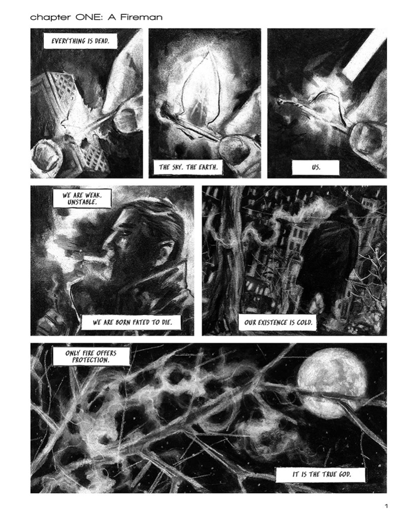
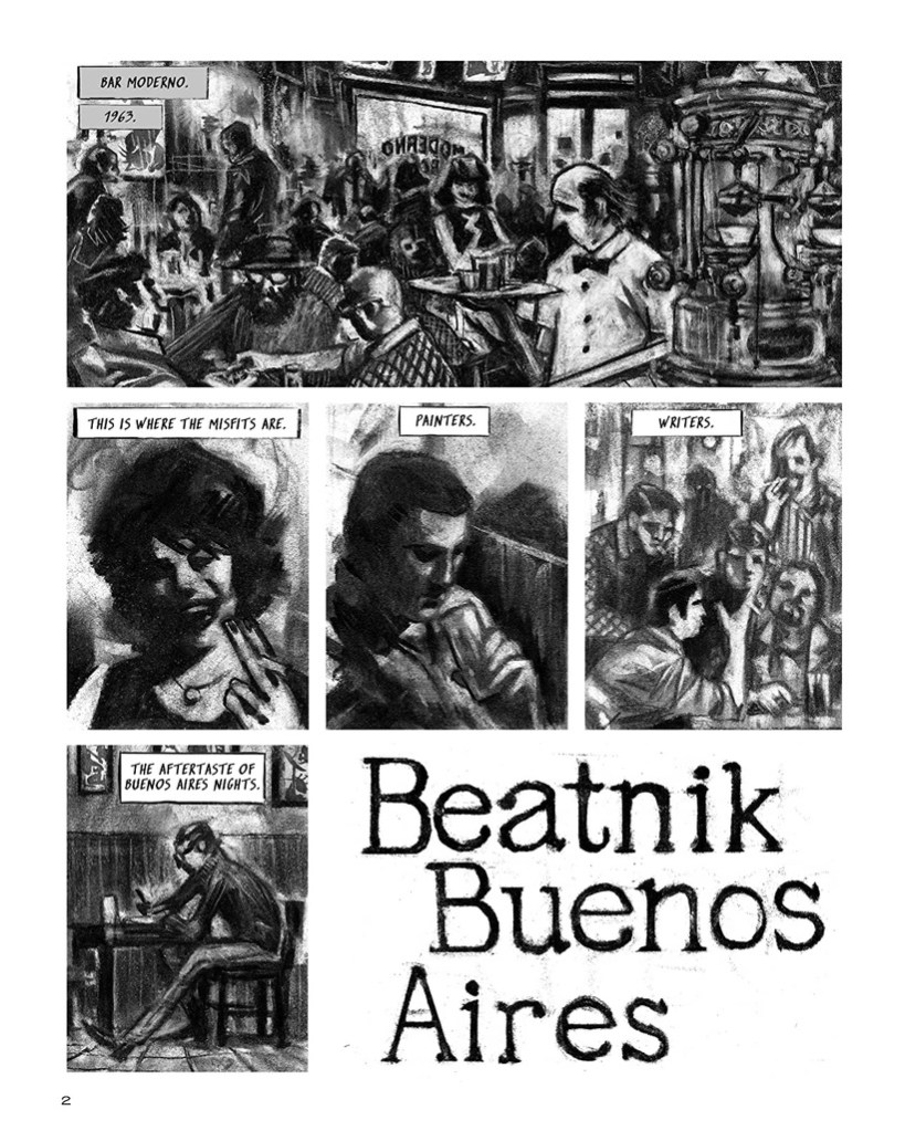
So what do we have here, in purely narrative and aesthetic terms? Well, in one respect it’s a classic caper. In another, it’s a surreal spin on police procedurals. In still another, a sprawling-ensemble slapstick yarn. And in yet one more, a futuristic sci-fi comedy thriller. Upping the ante still further, each of these respective genre sandboxes the narrative is playing around in is shot through with elements of pastiche, and so it’s fair to say Hurk is both marginally beholden to them and sending them up (or, as they’d say on his side of the pond, “taking the piss out of them”) simultaneously. Now throw in the added elements of each component riffing off the others and being in conversation with them, all while being recognizably part of the same world and story thanks to Hurk’s vivid, energetic, stylized, colorful, geometrically-informed cartooning, and the end result is something that should, by all rights, probably be a cacophony of literary and visual noise, but instead builds up in truly symphonic fashion.

Which isn’t to say, of course, that the occasional note of discord doesn’t linger in the background or, on occasion, force itself to the fore. There are punchlines that fall flat, story “beats” that miss the mark — but the overall trajectory of the piece is never derailed in any appreciable, lasting manner, and the only thing that quells the urge to keep turning the pages is the desire to spend more time “oohing” and “aahing” over the ingenious little flourishes of the one you’re already on. Don’t be afraid to take your time with this comic, then, even if the pace is rapid and frenetic, verging on the breakneck.

And so we return to our analysis of the phenomenon of critical analysis itself. Jinx Freeze is, perhaps, easier to praise than it is to describe, at least for someone of my meager capabilities — and it’s arguably greater on the whole than the sum of its parts would, upon first reading at any rate, suggest. Although, the more I pore over it, the more I come to see the “little things” that come together to form the “big picture” are all there, either in plain sight or hiding in it. Here’s what I do know : I didn’t want it to end, and when it did, I wanted to start reading it all over again. And whaddya know? That’s exactly what I did.
************************************************************************
Jinx Freeze is available from Avery Hill Publishing at https://averyhillpublishing.bigcartel.com/product/pre-order-jinx-freeze-by-hurk
Also, this review is “brought to you” by my Patreon site, where I serve up exclusive thrice-weekly rants and ramblings on the worlds of comics, films, television, literature, and politics for as little as a dollar a month. Subscribing is the best way to support my continuing work, so I’d be very appreciative if you’d take a moment to give it a look by directing your kind attention to https://www.patreon.com/fourcolorapocalypse