Ryan C.'s Four Color Apocalypse

There’s beauty in simplicity, as the cover of Tana Oshima’s newest self-published mini, Nabokova, clearly demonstrates. It’s stark, perhaps even spartan, but deeply communicative and precisely thought through. It imparts its message with crystal clarity and nothing by way of fuss or muss.
But there’s beauty in complexity, too, and this comic is also proof positive of that, as we’ll get to shortly. And trust me — this really only scratches the surface of the contradictions and conundrums contained herein. Bring your hardhat, folks — this one takes some real work.
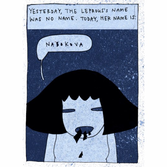
On a purely physical level, this is a book that exemplifies the kind of quality artistry and craftsmanship we’ve come to expect from Oshima in fairly short order — printed in rich colors and varying tones and gradations (blue being dominant in all things — okay, almost all things) on high-quality paper between heavy cardstock…
View original post 455 more words

Pingback: Lisa’s Week In Review: 9/9/19 — 9/15/19 | Through the Shattered Lens